
Featured · 04
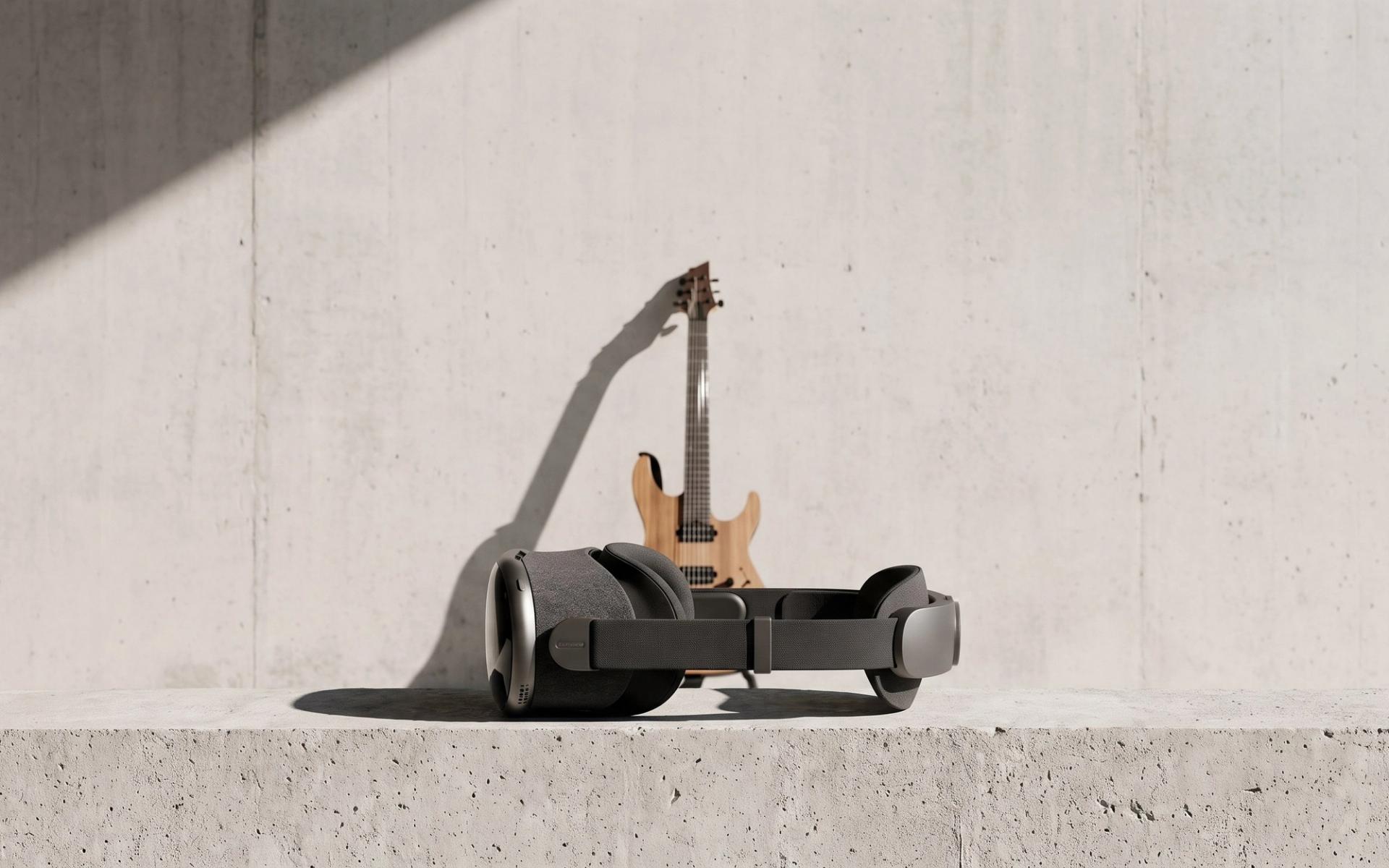
GUITAR FLOW
Year
2025
Role
Immersive Design & Unity Prototyping
Discipline
Mixed Reality · Interaction
About
Put the lesson on the instrument
Almost everyone learning guitar alone is doing the same thing: watching a video of someone else's hands and trying to mirror it onto their own neck. Guitar Flow removes the translation step.
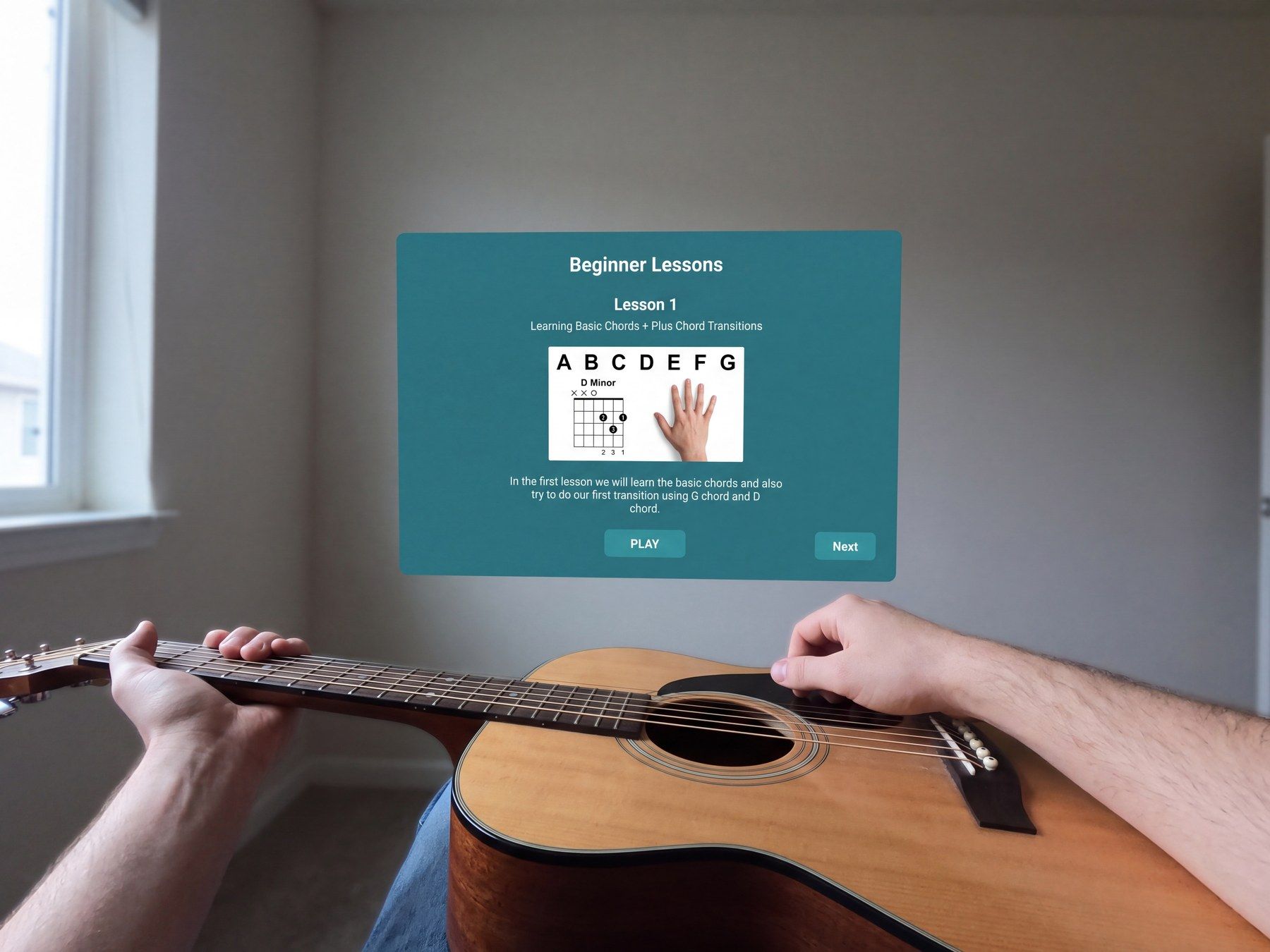
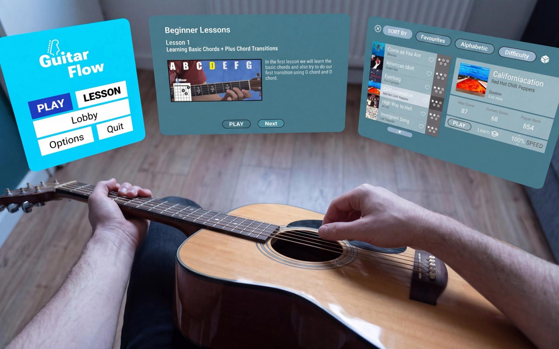
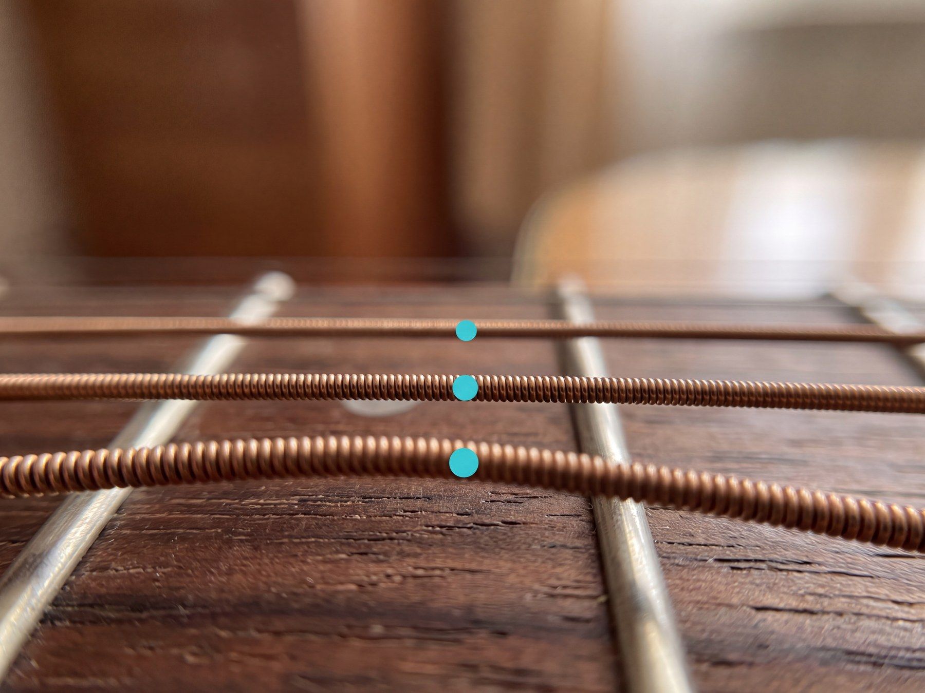
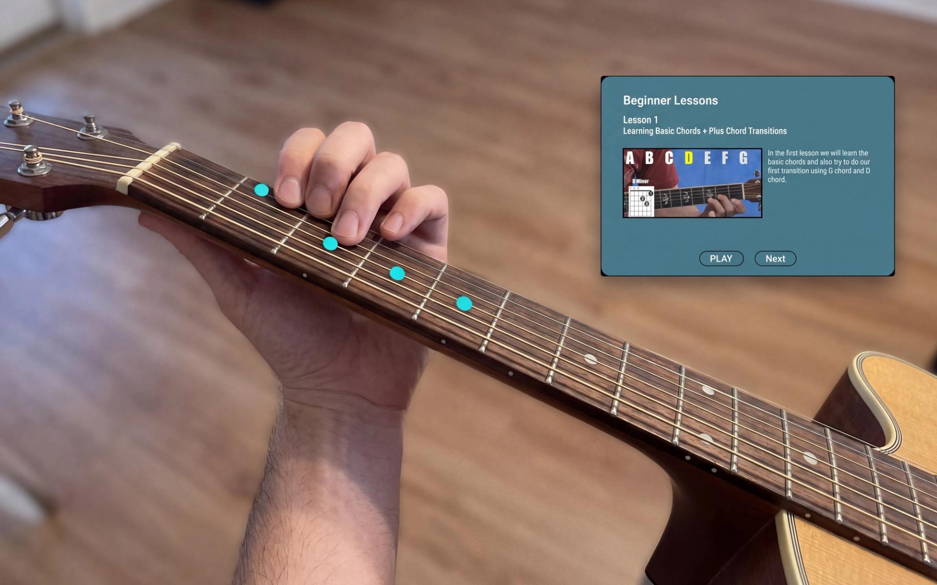
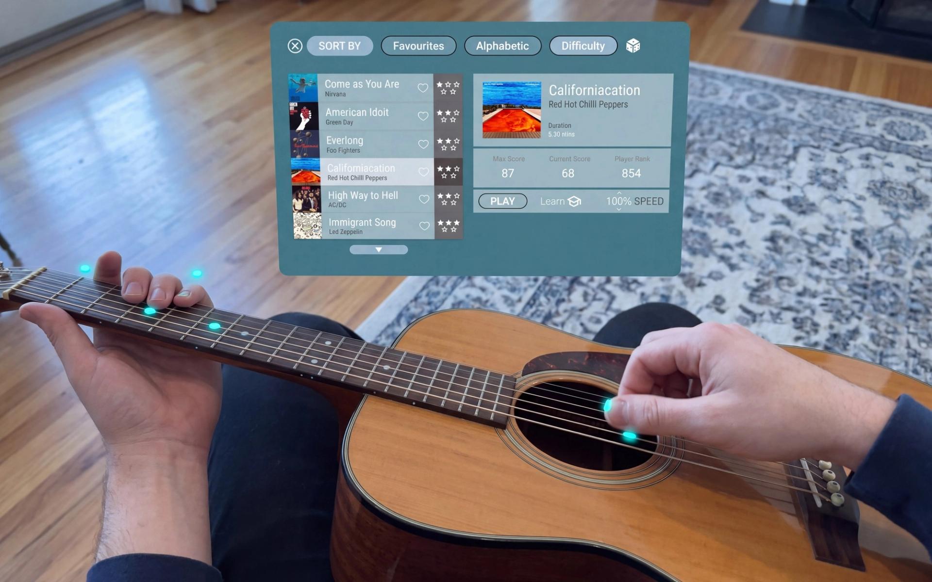
Six string lines register against the real instrument, the string you need next lights up, and chord shapes appear as finger positions rather than diagrams. Strumming is tracked as motion, so timing becomes something the system can tell you about.
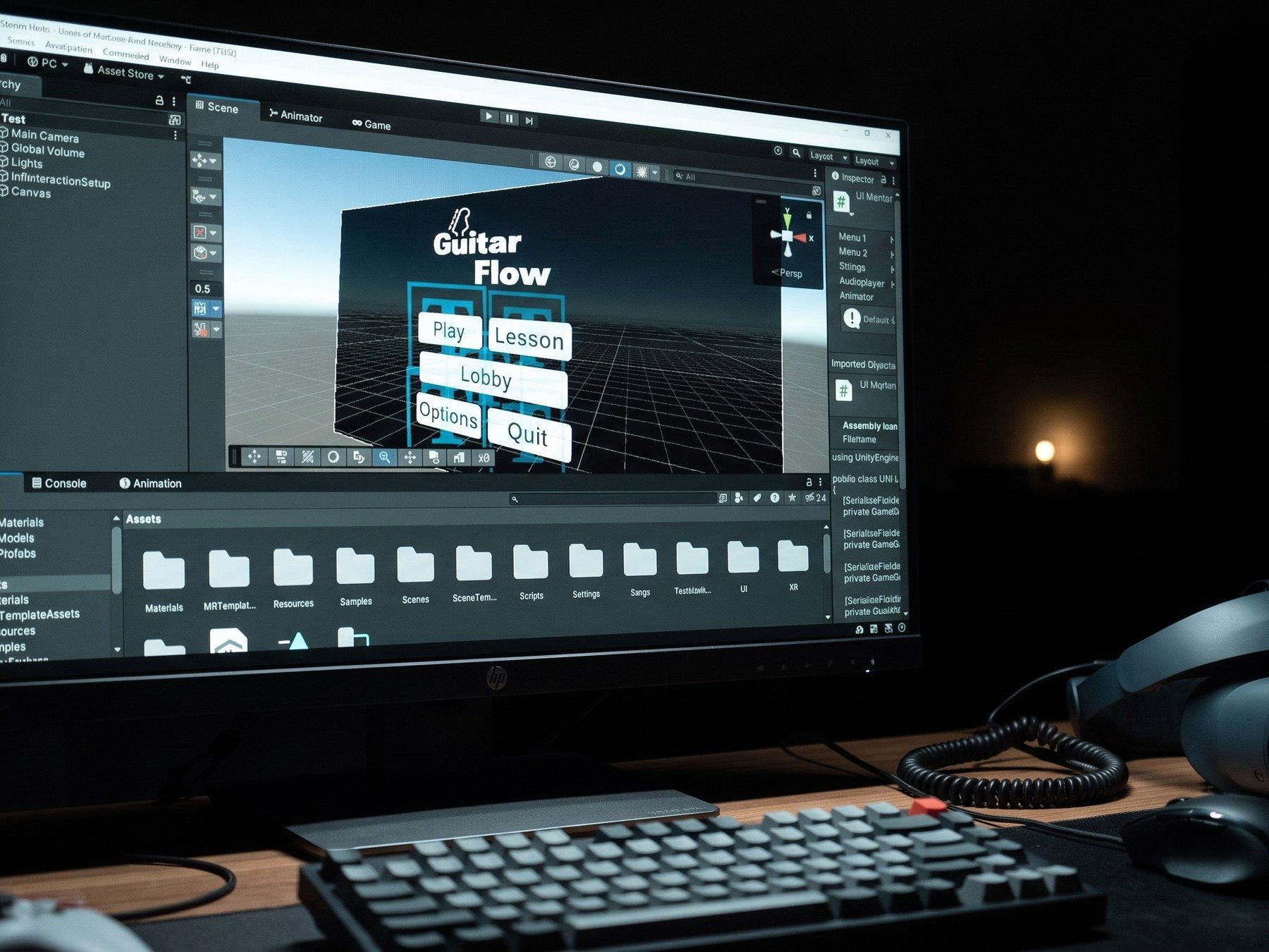
Unity 6 for the MR scene, Blender for geometry, Figma for the interface, and a build people could put on and play rather than a video of one.
Process
Six learners and four papers
Five of the six students I talked to learned mainly from YouTube. Four had tried a learning app and dropped it within a week, citing slow progress and nothing personal in the feedback.
Three used tab notation and described the same difficulty translating from a screen to the strings. Then the literature said the same thing back to me from a decade of studies: system after system improved immersion and shipped without the one thing a learner alone in a room actually needs, which is being told they are wrong.
One study scored 82 on the System Usability Scale and had most participants playing basic chords within an hour, then listed real-time auditory feedback as its main omission.
Challenges
The headset gets in the way
A HoloLens case study found no learning advantage over traditional teaching at all, with participants struggling past ten minutes of wear. In another, fret highlighting shown on a screen beat the head-mounted version, because a narrow field of view and visual clutter buried the one thing the learner needed to see.
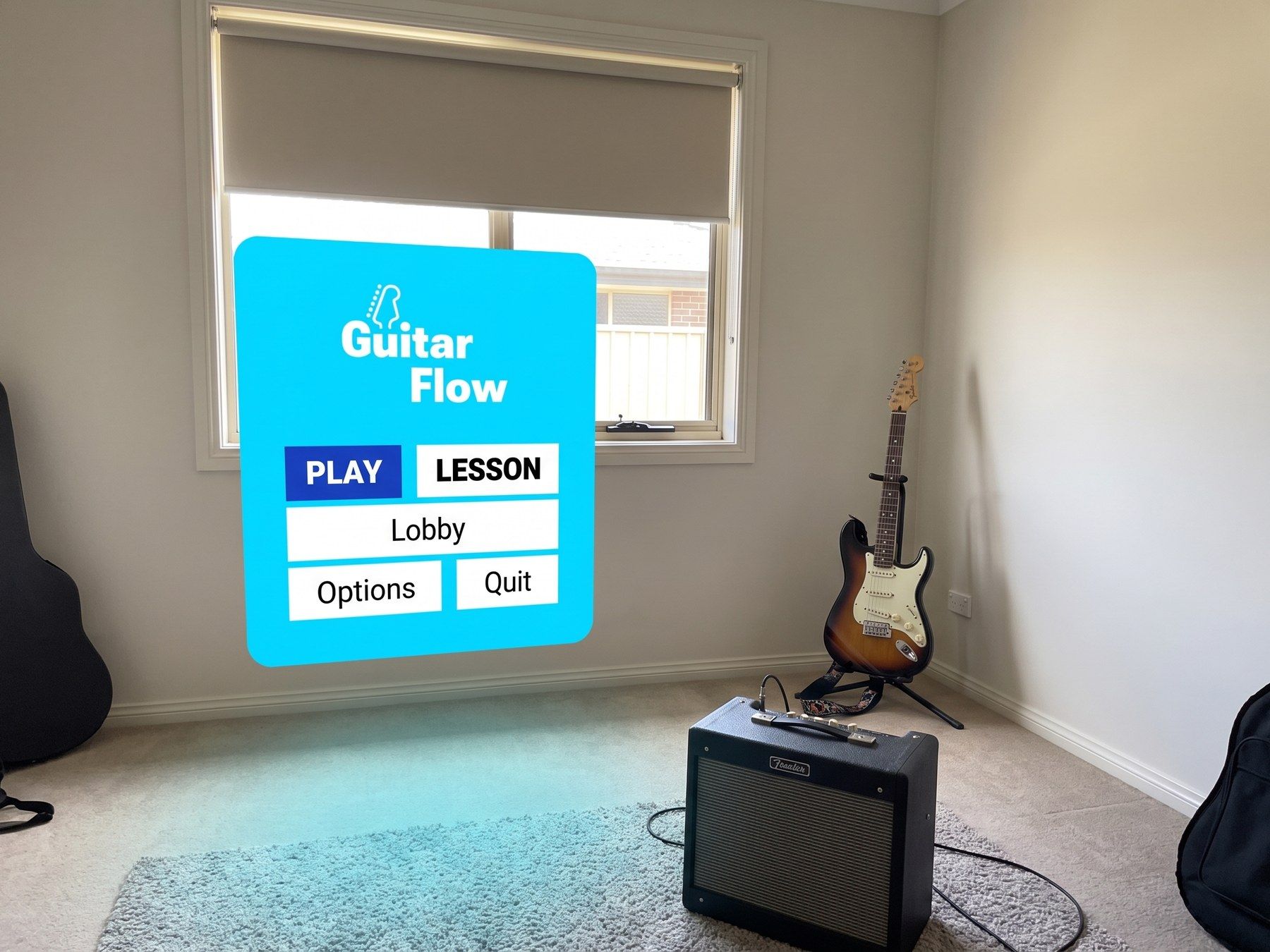
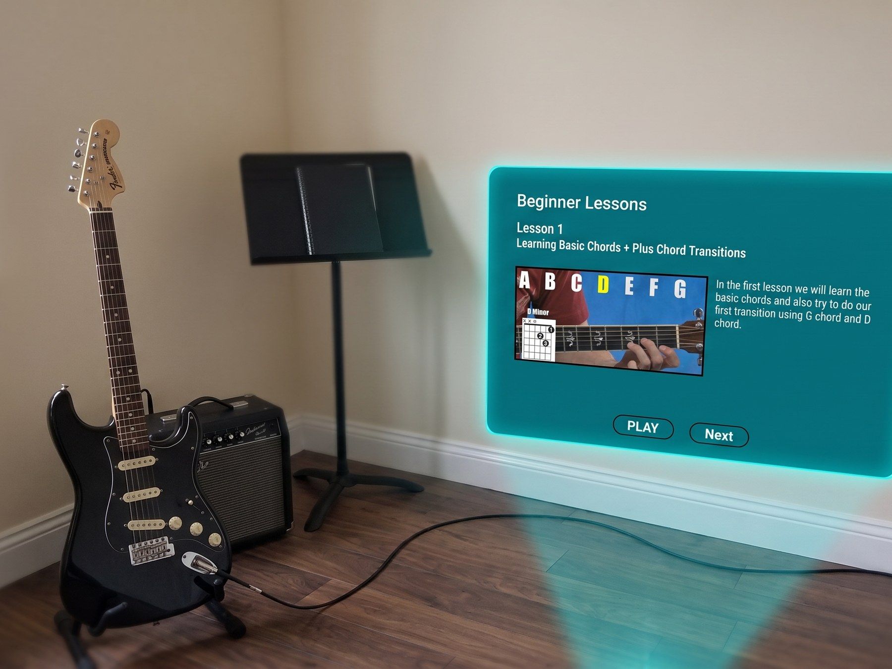
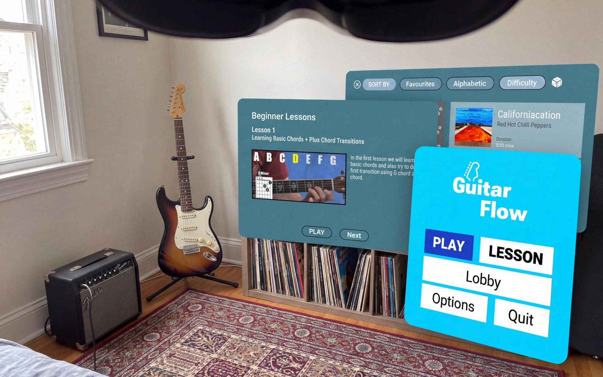
My own testing repeated it: the menu blended into the room behind it, and hand tracking held for open chords but lost the little finger on barre chords, which is exactly where a beginner needs correcting.
Both testers asked for the same thing unprompted: tempo that slows itself when you struggle, instead of leaving you behind and calling it practice.
Craft
Legible at arm's length
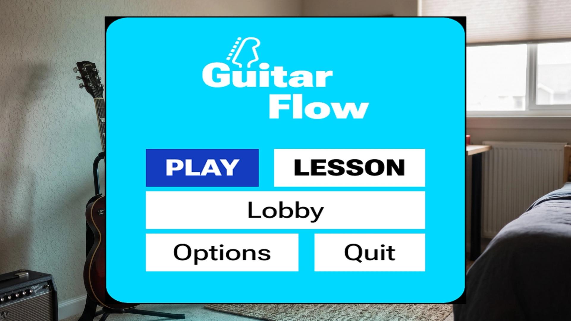
Most of the work went into reading distance. Type that is comfortable on a desk disappears against a lit room, and depth lies on a flat monitor, so the overlay was tuned in the headset rather than in Figma.
The active string ended up cyan against white because it survives a bright room and a dark one without ever reading as decoration. Everything that is not the next note sits one layer back.
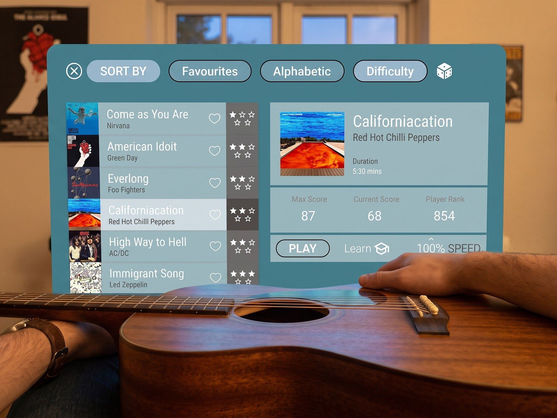
Menus, songs and lessons stay out of the way: a swipe in the air moves between them, a pinch pulls a chord closer when you want to inspect it.
Results
The copying problem, closed
Three players used the build. What landed was the part I was least sure of: overlays for chords read immediately, and real-time tabs during riffs gave one player the timing feedback they had never had while practising alone.
The question changed shape too. Instead of asking how a chord is supposed to look, they started asking whether they were holding it right, which is the question the system can actually answer.
Testing wrote the roadmap in order: panels that follow the player rather than the wall, finger-level correction, adaptive tempo, and a freestyle mode, since the players who liked it most both asked to stop being taught and start playing.
System
A palette that has to beat the room
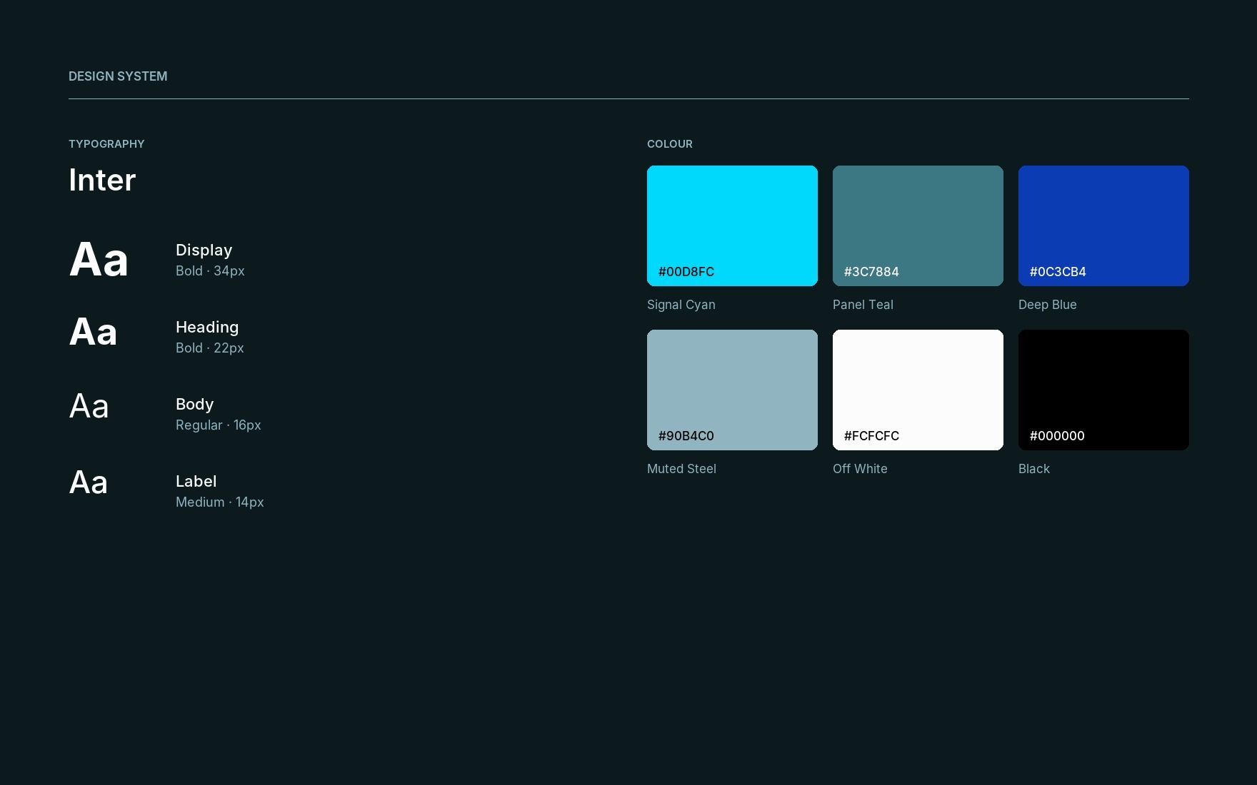
Everything here was chosen against a wall, not against a canvas. Panels are a desaturated teal because a neutral grey turns muddy the moment real light passes through it, and a saturated one competes with the guitar.
Cyan is the only bright value in the system and it belongs to one thing, the note being played. Deep blue marks a committed action and appears once per screen at most. The steel grey is for anything the player is not meant to look at yet, which in mixed reality is most of the interface most of the time.
Nothing in the system is allowed to be a thin line or a light weight. Both disappear at arm's length against a lit room, so the smallest label sits at 14px medium.
Next project