
Featured · 05
NAVAID
Year
2024
Role
Product & Interface Design
Discipline
Assistive Tech · Hardware
About
Keep the chair, add the driving
Autonomous wheelchairs exist. They cost more than most people can spend and they arrive as an entire new chair, which means giving up the one already fitted to your body.
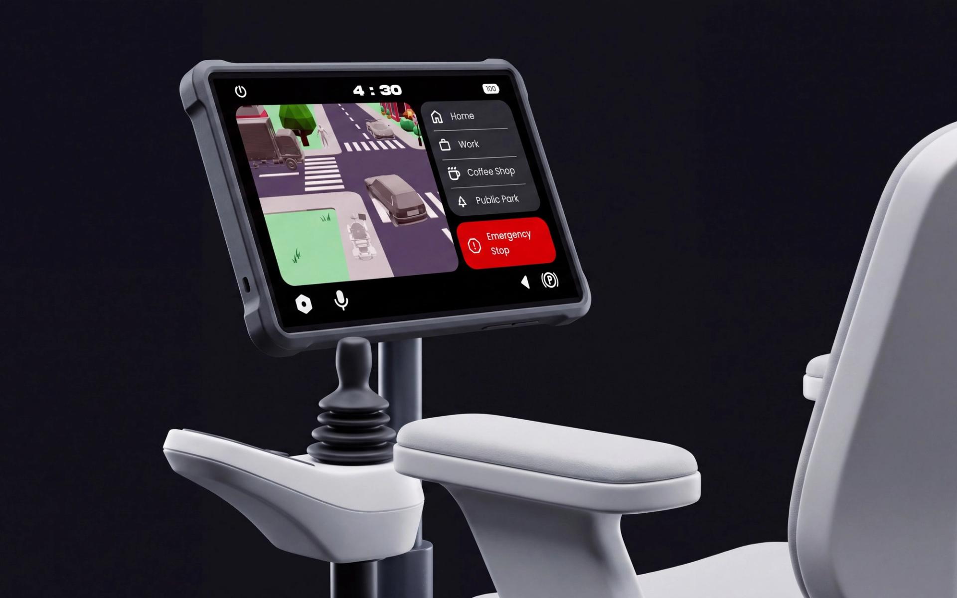
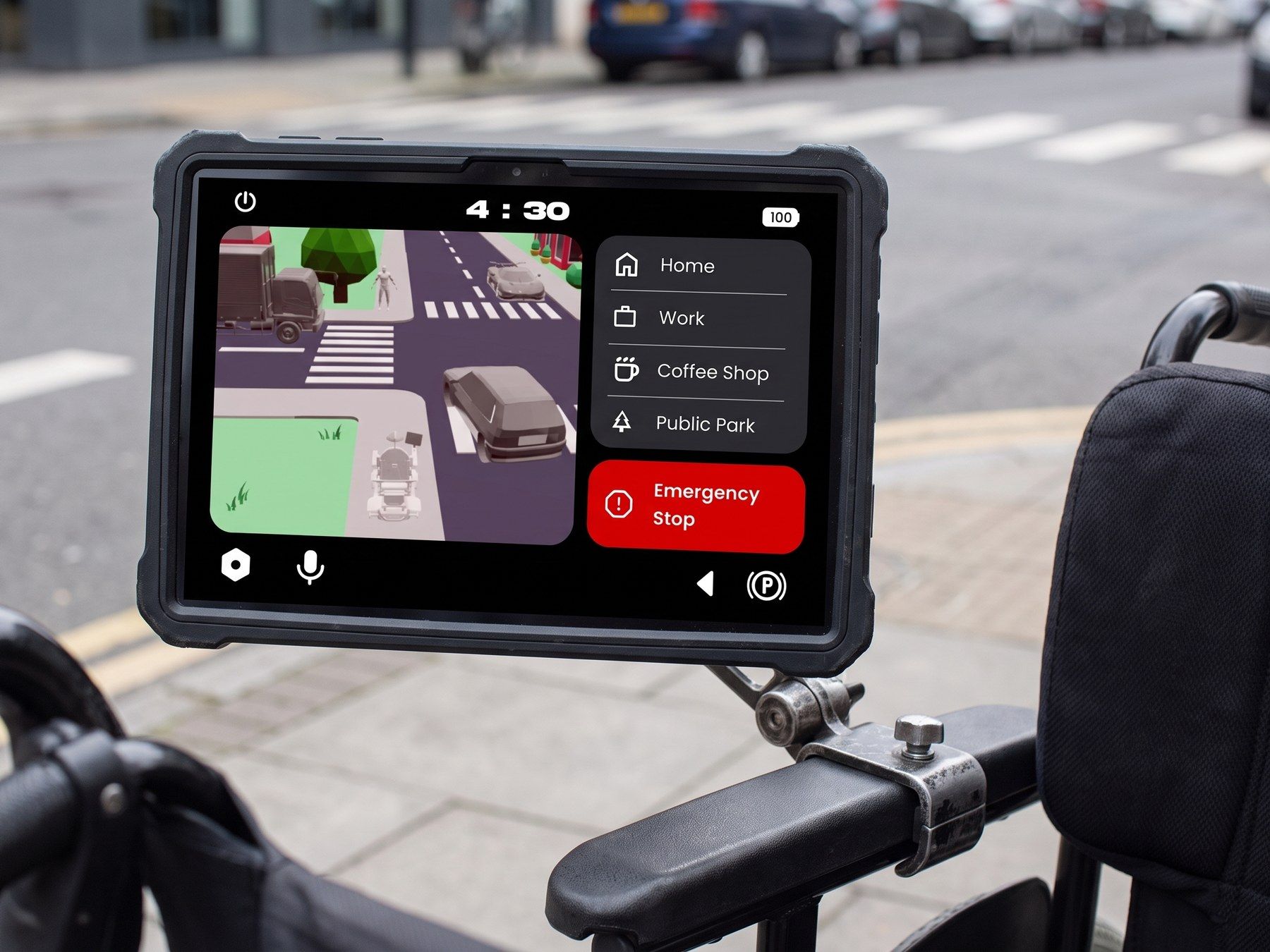
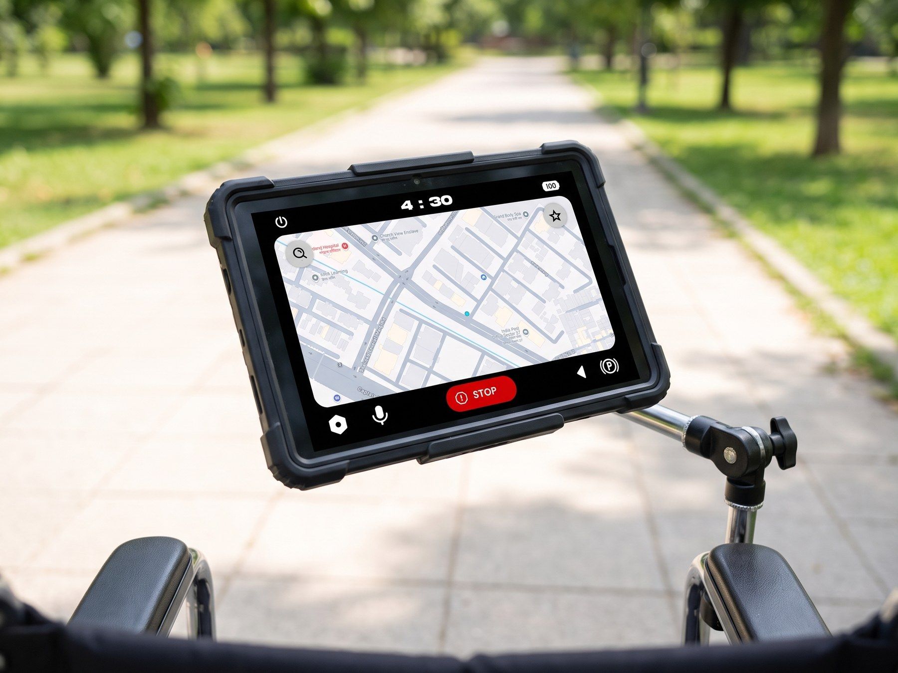
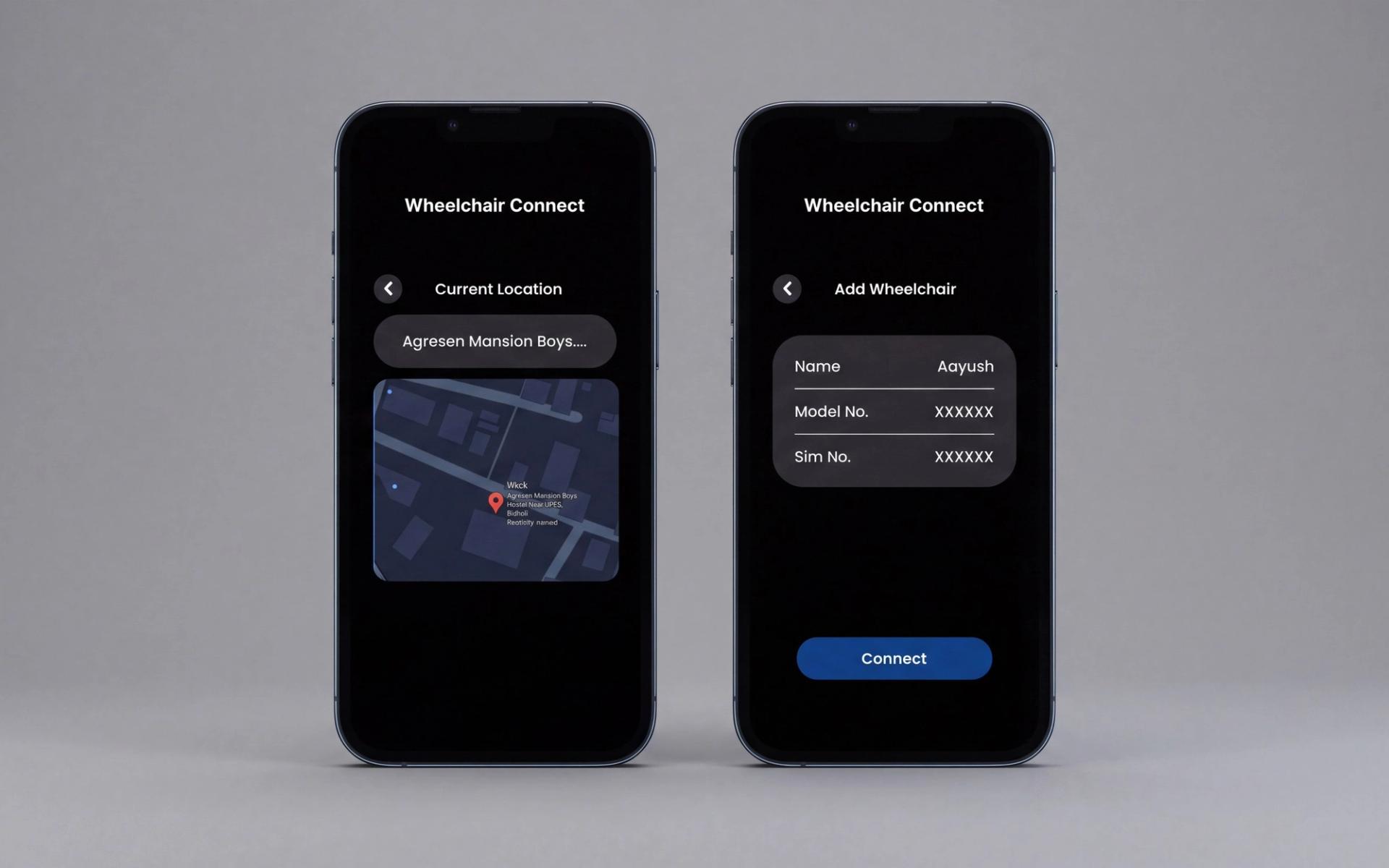
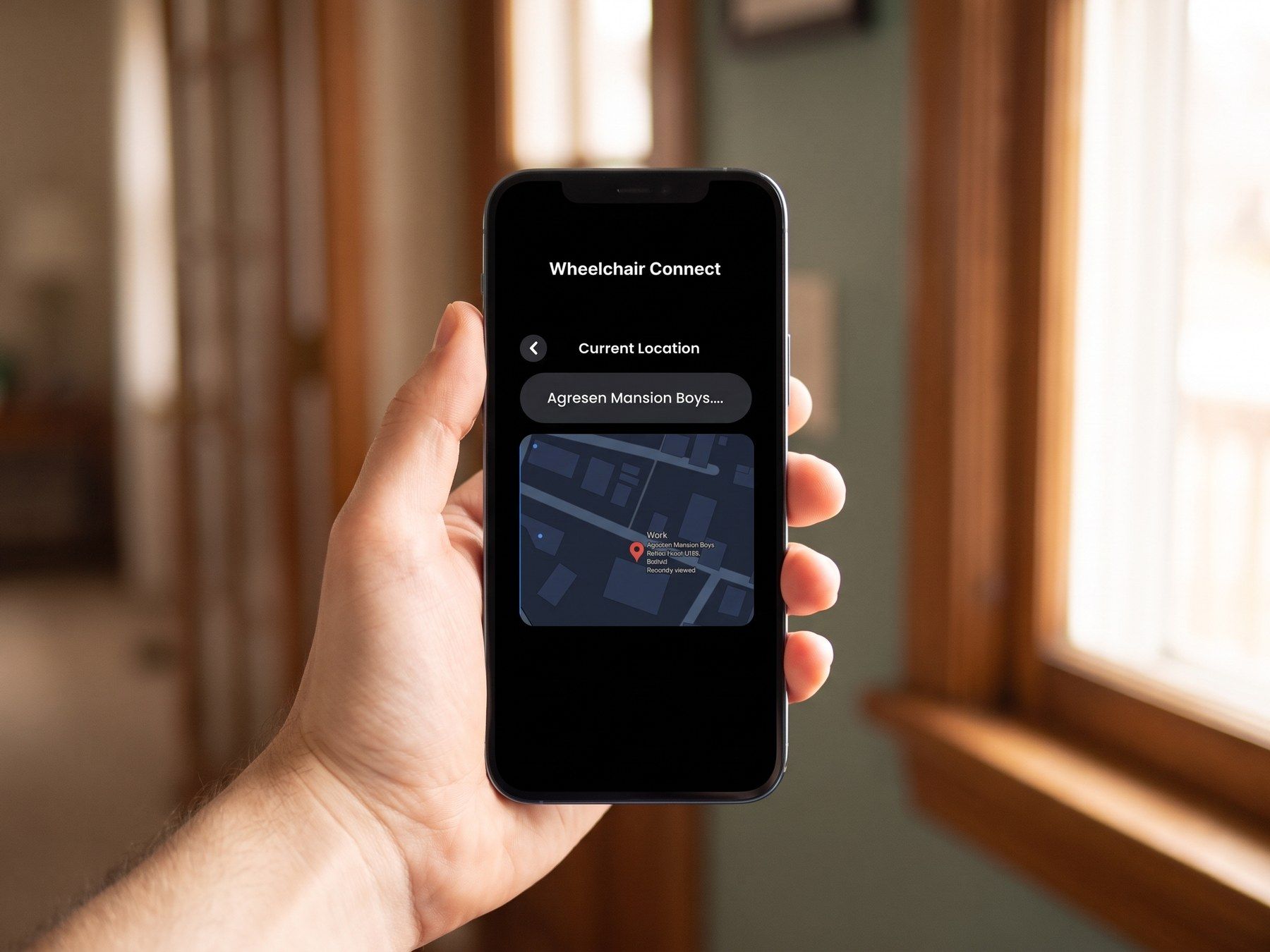
Navaid is the other route: a sensor and screen module that mounts to the chair someone already owns, drives it to a destination they picked, and lets a family member see where it went.
India's 2011 census counted 26.8 million disabled people, 5.4 million of them with mobility-related disabilities. Most of those chairs are manual, and the cost of a manual chair is paid by the shoulders.
Process
One long interview, then the literature
A friend put me in touch with an artist who uses a manual chair daily, and we talked it through over a video call. What they described was never distance.
It was cost. Ramps that satisfy a code somewhere still strain arms and shoulders several times a day, and a full day of propelling cuts short whatever was planned next.
They own a modified car and still cannot stow the chair in a tight space without help. Galleries that call themselves accessible turn out to have doors with no opener and aisles too narrow to turn in.
One conversation is one conversation, so the literature had to carry the rest: where autonomy genuinely helps is severe impairment, ageing users, cognitive load, and long unpredictable spaces like hospitals and airports.
Challenges
Assistance without surveillance
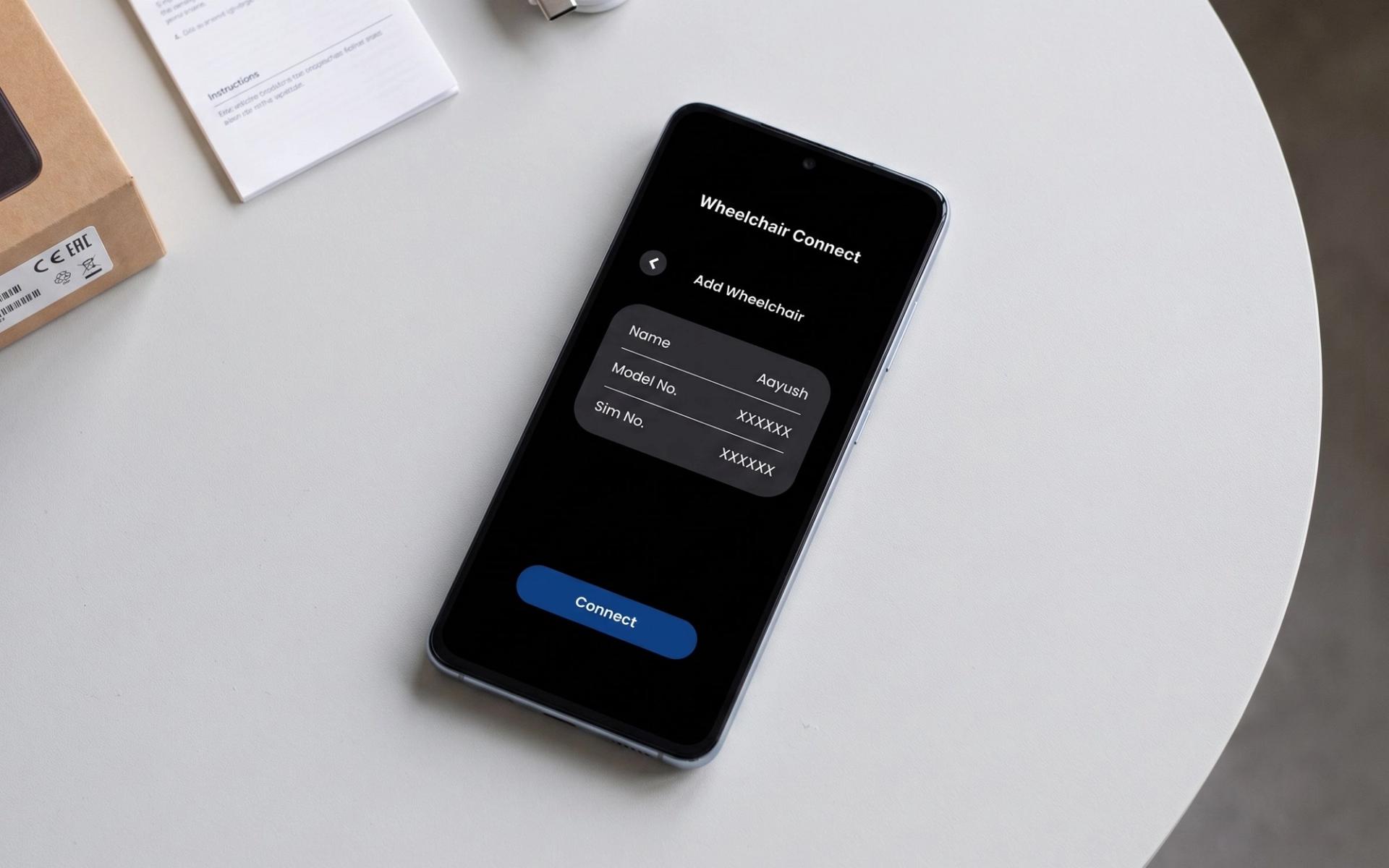
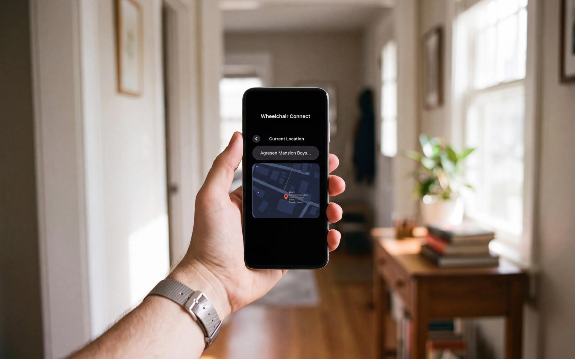
The caregiver app is the part that could go wrong quietly. Location sharing between a disabled adult and their family is support in one direction and monitoring in the other, so pairing is explicit and the app carries nothing beyond position and status.
The system also does not pretend to replace a caregiver. Medication and routine checks stay human work. What autonomy removes is needing another person present for every trip down the street.
That framing is also what makes it defensible financially: fewer hours of paid assistance over years, without asking anyone to give up the help they actually need.
Craft
Built in MDF before pixels
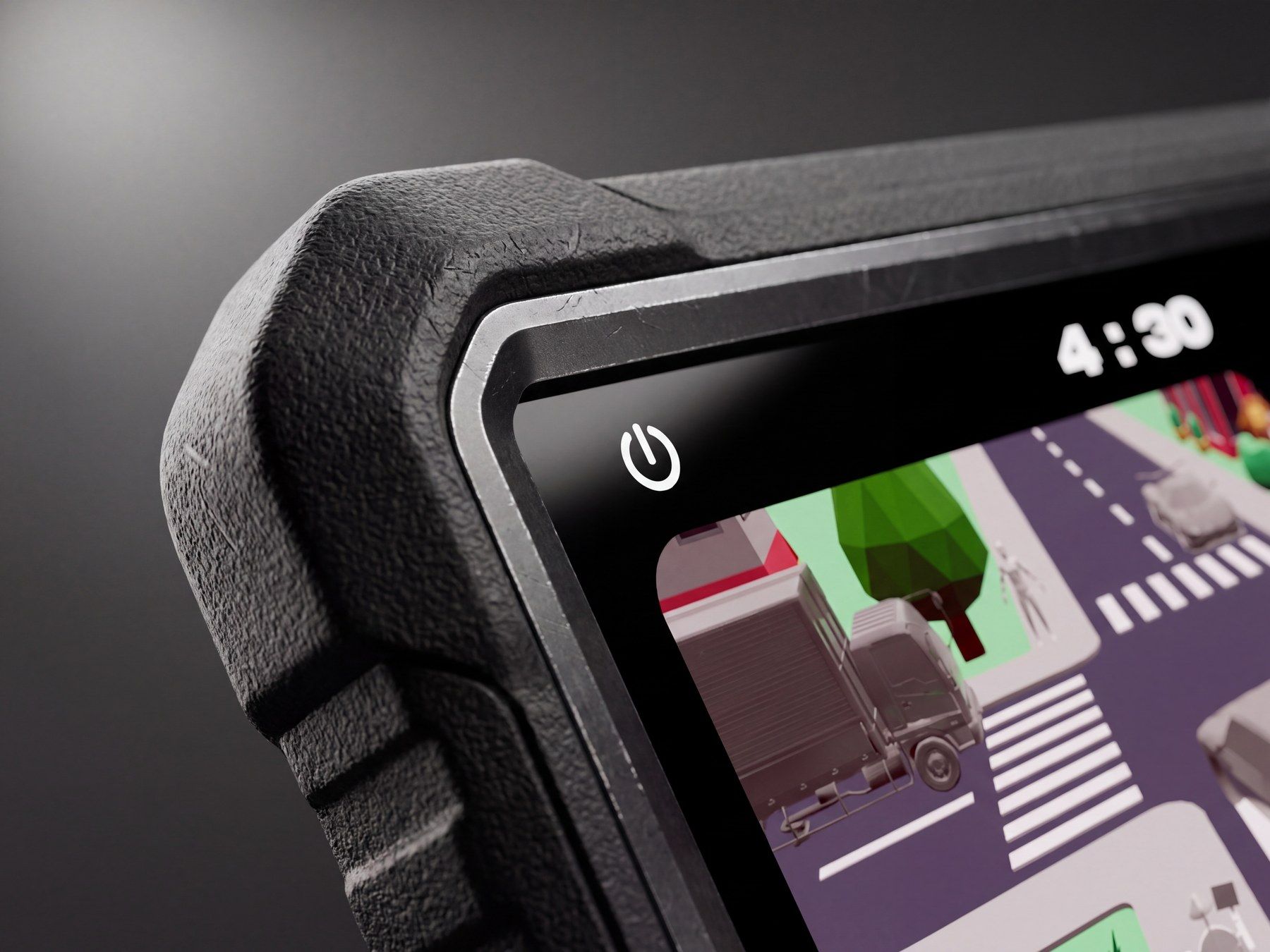
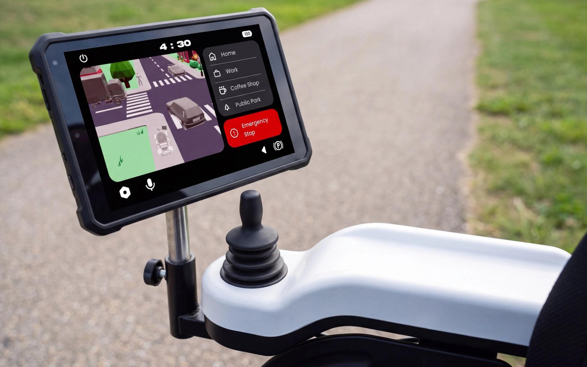
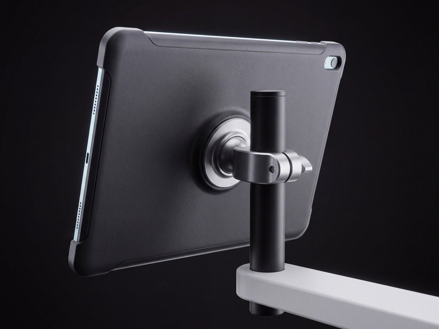
A screen you look at for hours is an ergonomics problem before it is an interface problem, so the module was built full size in MDF first, as a standalone model rather than mounted to a chair. The display landed at 195 by 135 millimetres on a stand that angles toward the user's head rather than sitting flat.
On screen, sensor readings draw the surroundings on the left so you can see whether the system noticed the truck, and saved destinations sit on the right, changing between indoor and outdoor sets.
Emergency Stop never leaves the screen. Everything else can be moved, resized or dropped, because a fixed layout assumes one kind of hand and one kind of reach.
Results
Where the real limit sits
The project ended with a physical model at real dimensions, a screen design tested against how a person actually sits, and an app that stays on the right side of the line between support and monitoring. It reframed the brief from building a better wheelchair to removing the reasons people cannot use the good ones.
The engineering ceiling in assistive design is high and rising. The real limits are cost, the fear of giving up a chair that already fits, and interfaces built for a body that is not the one using them.
System
One red, and it means stop
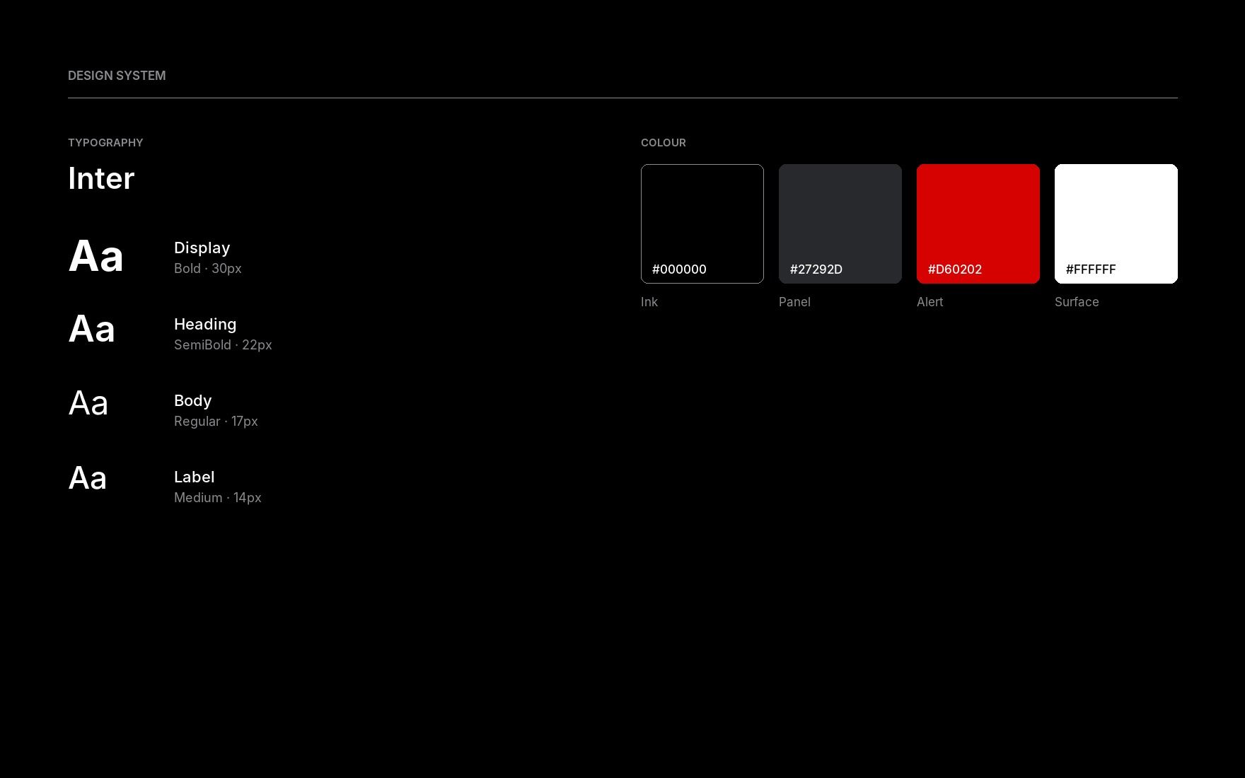
The whole palette exists to protect a single colour. Black is the chassis, a slightly lifted grey is every panel and control, white is every label, and red belongs to Emergency Stop and to nothing else on any screen.
That rule is the system. A chair moving under its own power is a machine with real consequences, and an interface that spends red on a delete confirmation or an error toast has already spent the thing it needed. Type sits heavier than a phone would, because this screen is read outdoors, at an angle, in motion.
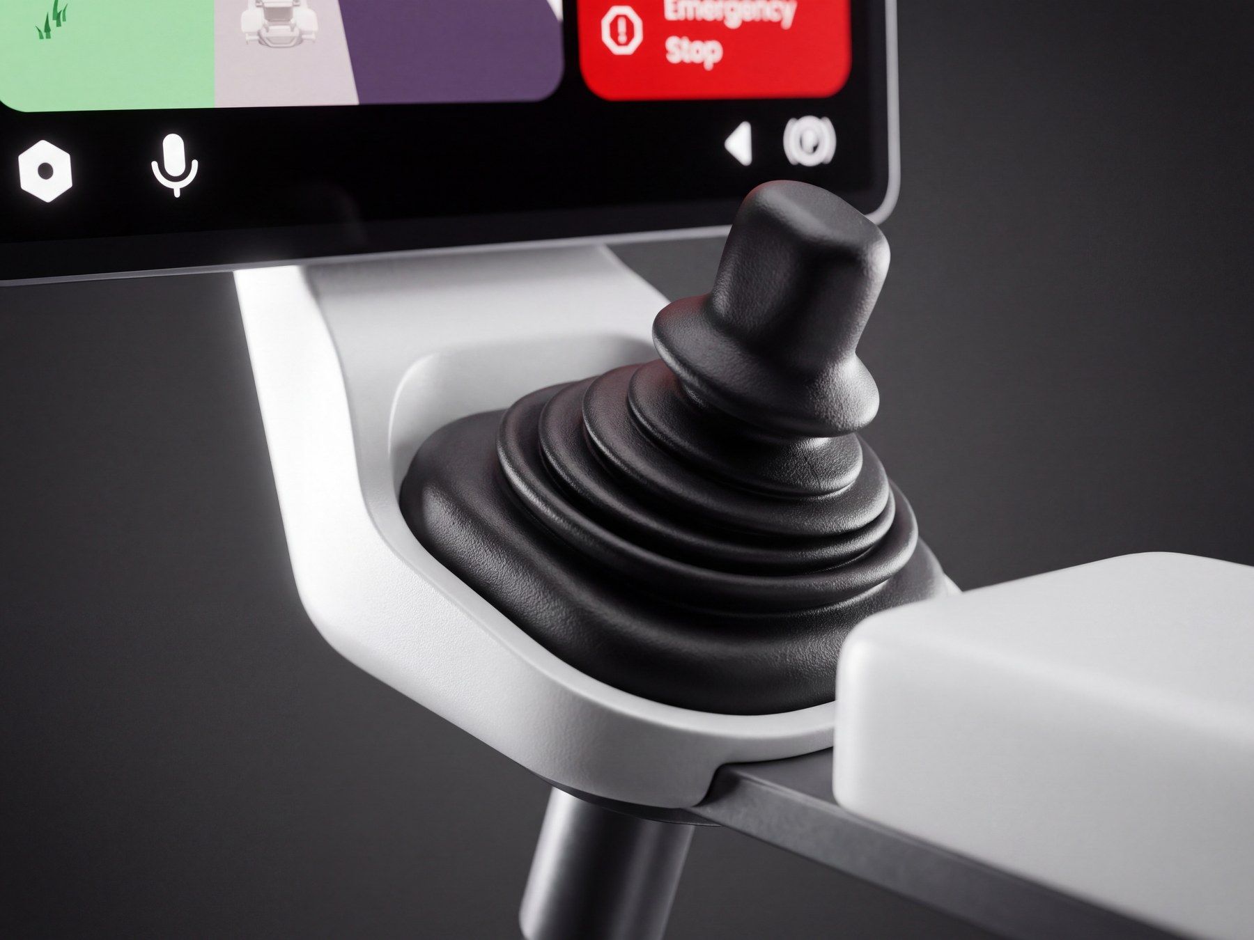
Every control is sized for a knuckle or a closed hand rather than a fingertip, which is what set the 17px body floor and the height of the destination rows.
Next project