
Featured · 03
MEMORY BANK
Year
2025
Role
UX Research & Product Design
Discipline
Product Design · Spatial
About
A gallery forgets the feeling
A photo library can tell you where you stood and when. It cannot tell you what the day felt like.
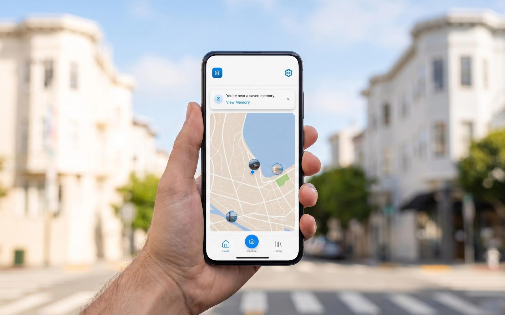
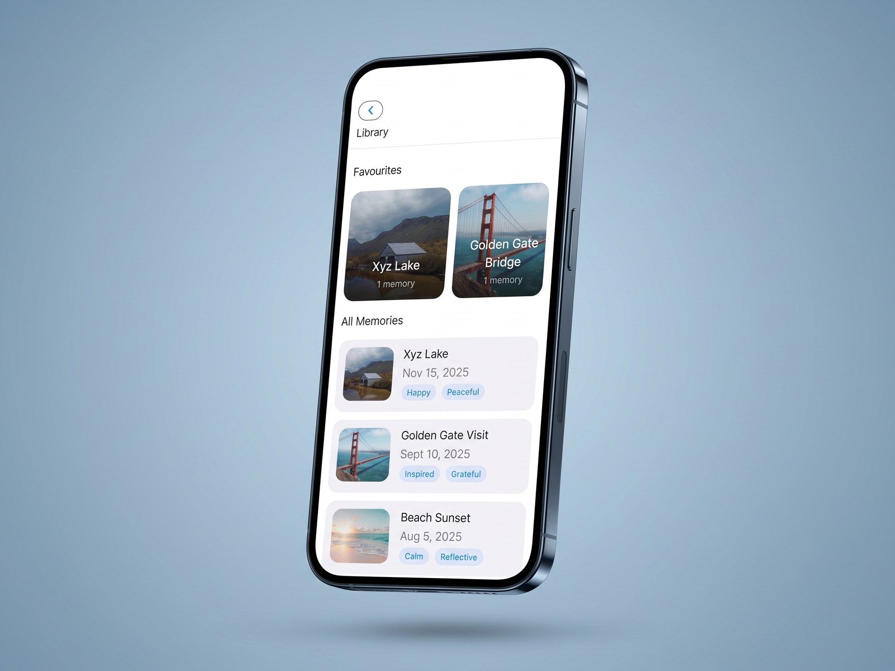
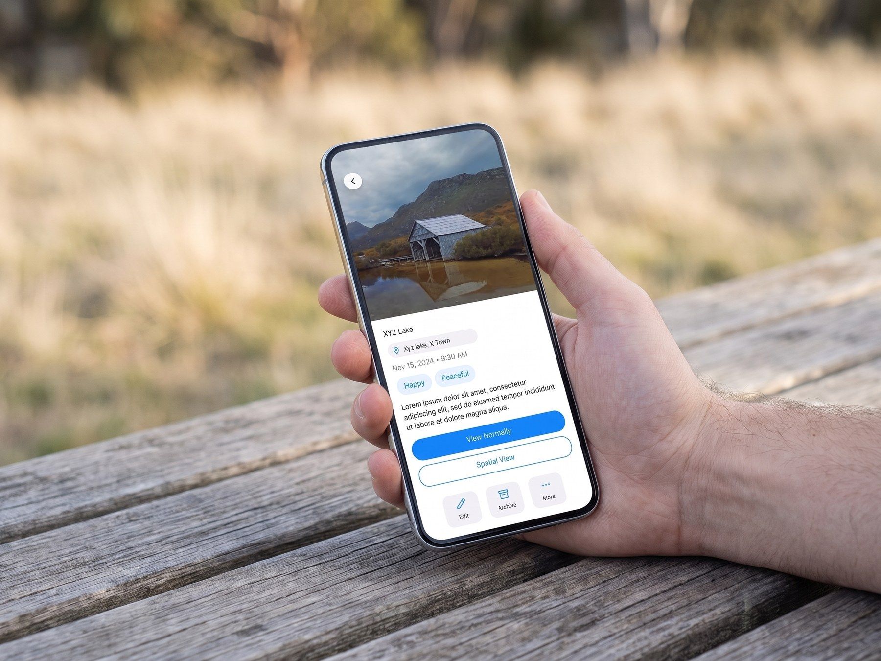
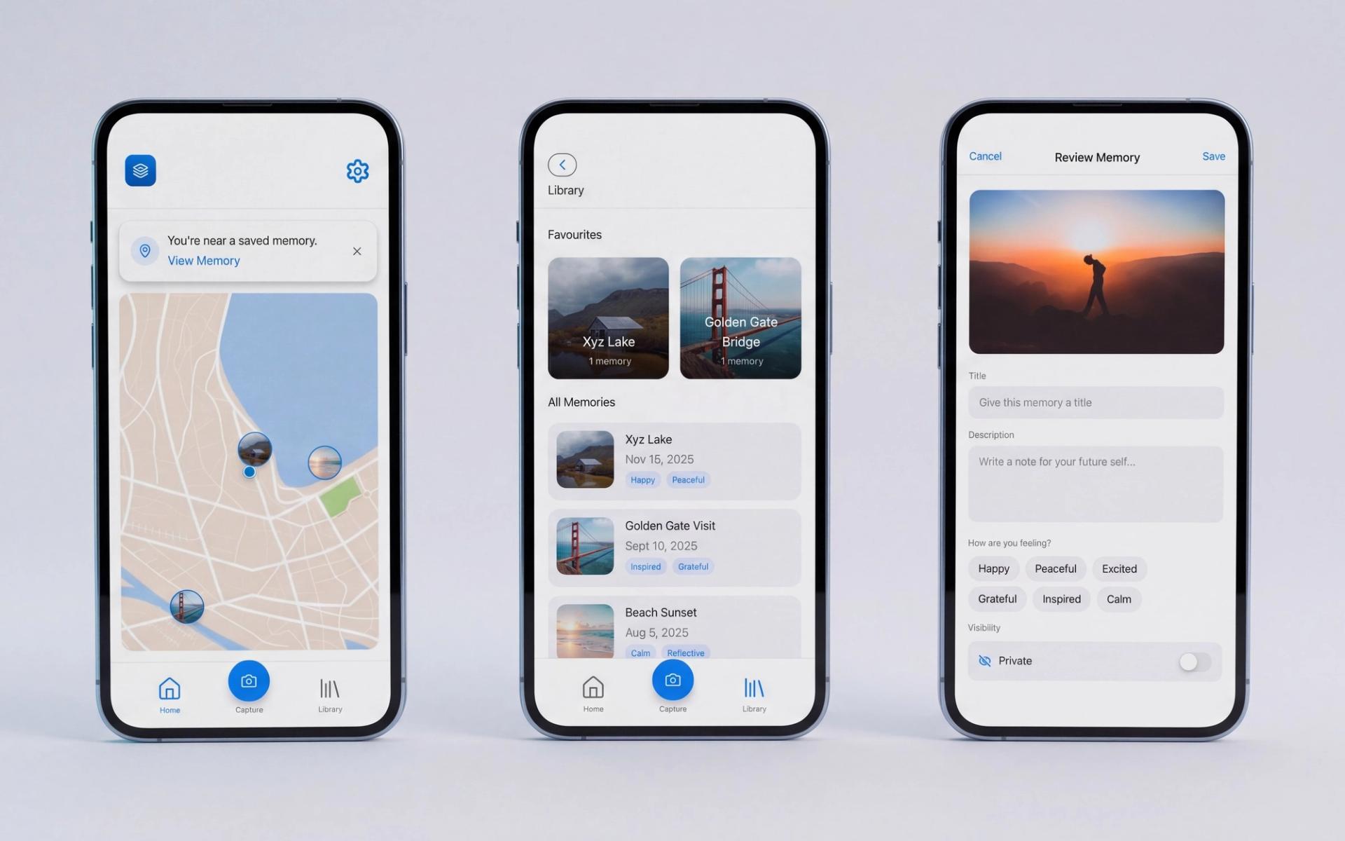
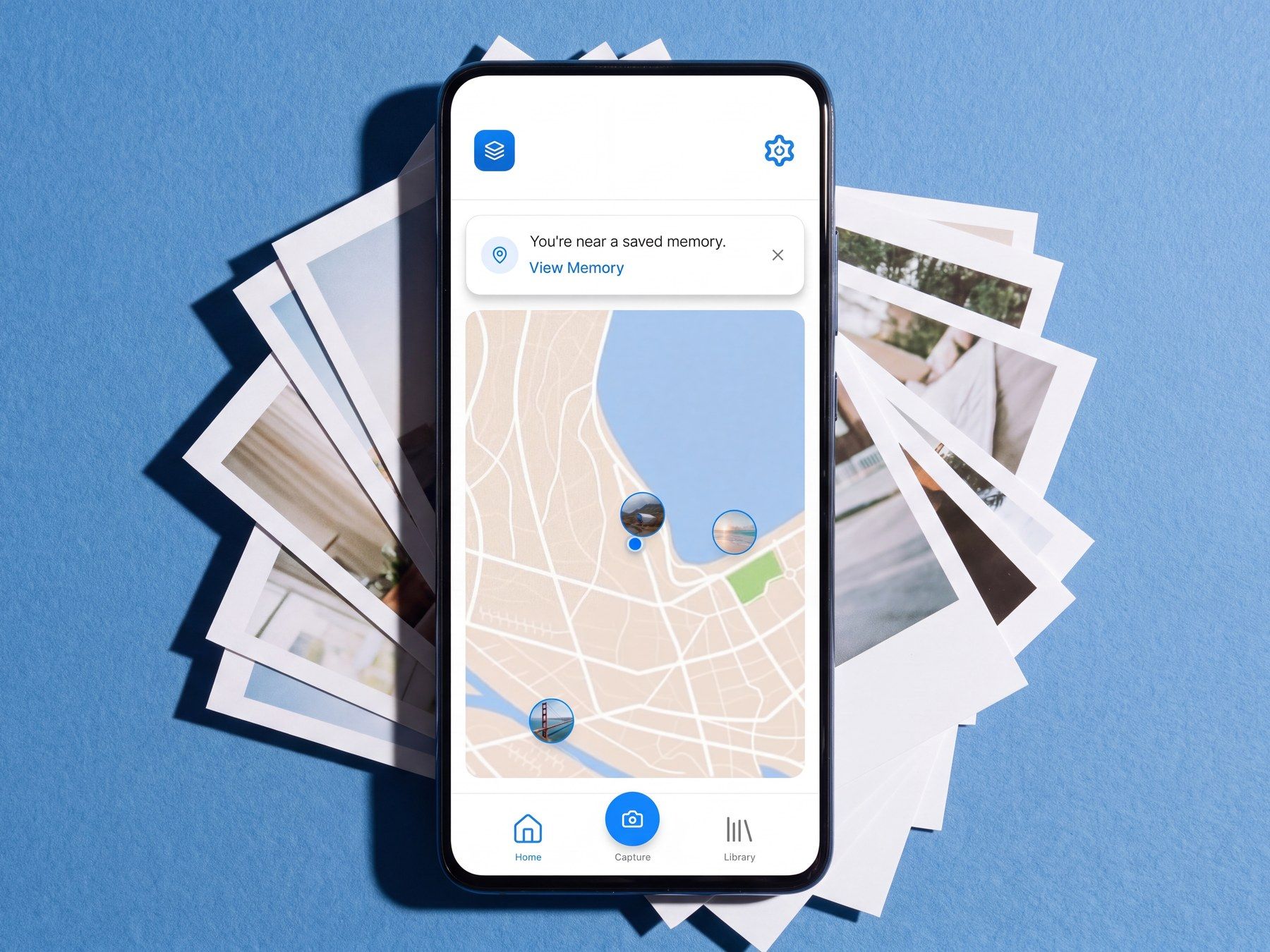
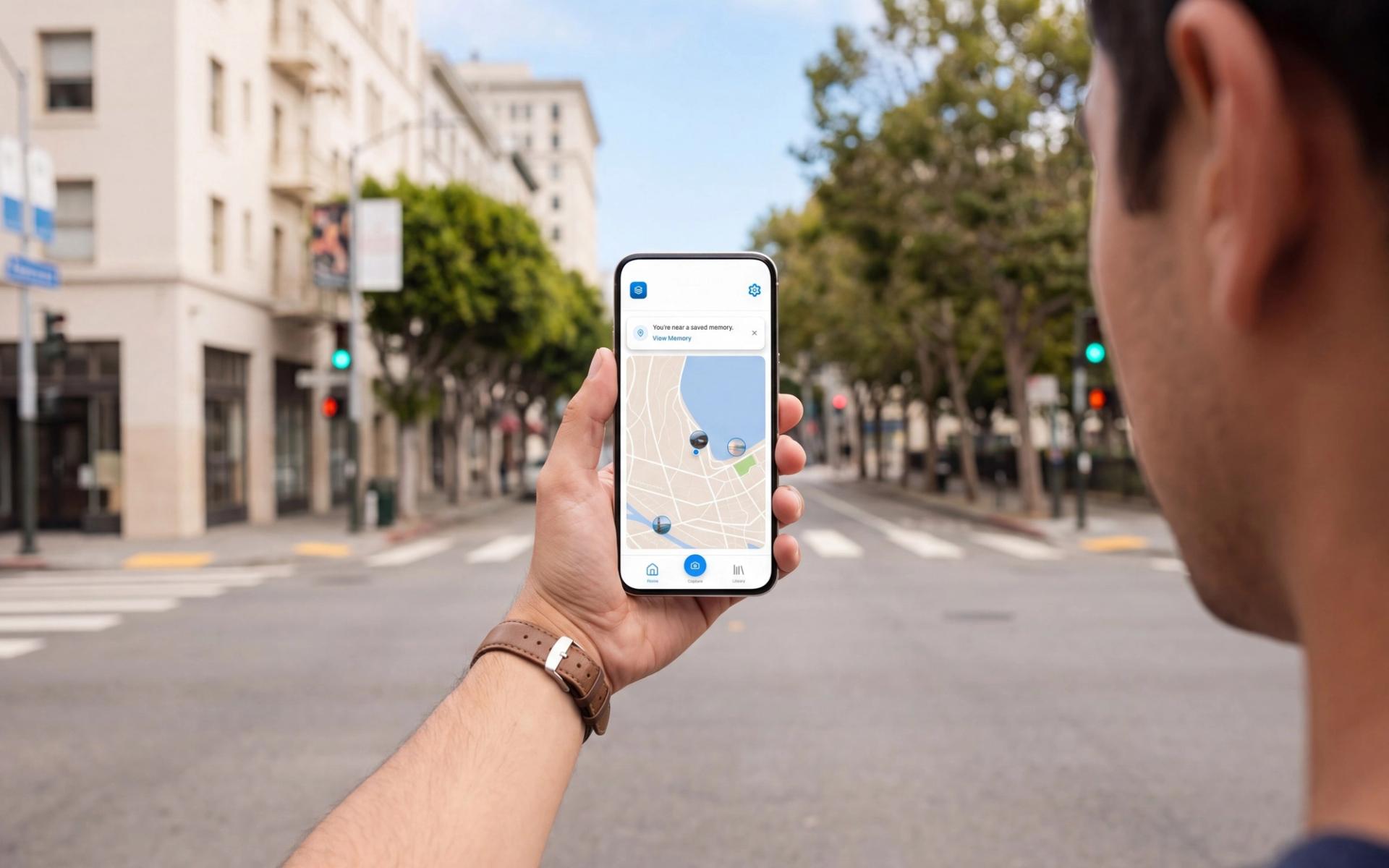
Memory Bank ties a photo to the place it was taken, along with the note and the mood you attached to it, then hands the whole thing back when you walk past that spot again. It is private by default, and the map is the home screen rather than a filter buried in settings.
Around 70% of digital photos are never opened again after the first week. In India, 82% of smartphone users store photos digitally and 27% revisit them in a given month.
Process
Twelve surveys, five long conversations
A survey went round twelve students online, and I sat down with whoever was willing to talk, one or two at a time, across five themes: how they capture, how they share, what places do to memory, what privacy means, and what they expect from a tool like this. Eight of the twelve did not organise photos at all.
Ten were interested in revisiting memories through AR, and every interview attached the same condition to it: the moment it gets complicated, they are gone. One put it plainly, that AR is cool until it is too complicated, and then they get bored.
A participant described passing their college café and having the memories simply arrive. Nobody described that happening while scrolling, and the gap between those two sentences became the product.
Challenges
Cutting my favourite feature
Then vs Now overlaid an old photo on the live camera with an opacity slider, and it was the most technically interesting thing in the build. Four of the five testers could not make sense of it.
They fought the alignment, misread the slider, and could not say what it was for. Several also failed to find the visibility control, because they expected privacy to sit inside editing rather than down a separate settings path. The least confident tester said they got lost, and asked me to make it simpler.
I removed the overlay entirely. Keeping it would have cost every user a little clarity to serve almost none of them, which is a bad trade however good the demo looks.
Craft
Two screens became one
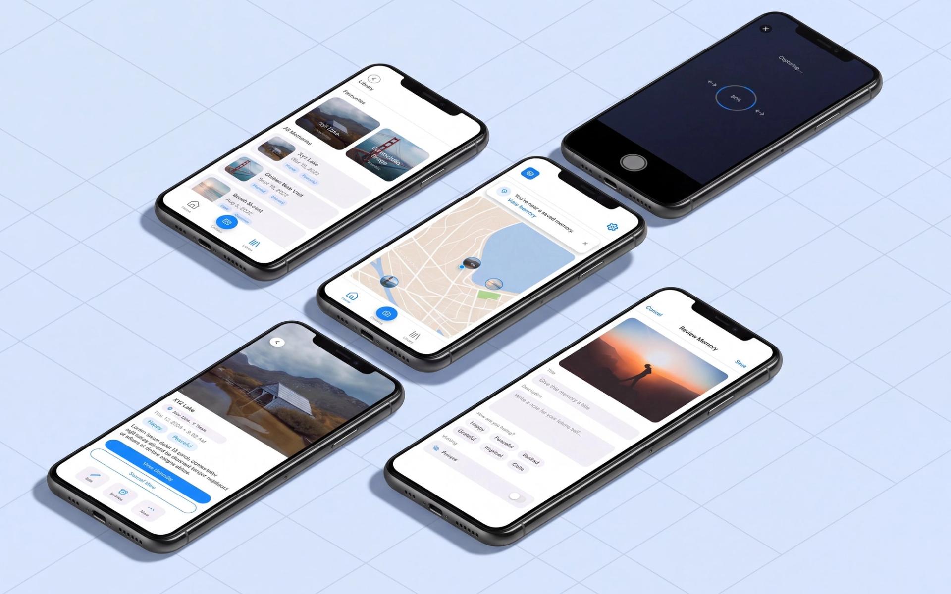
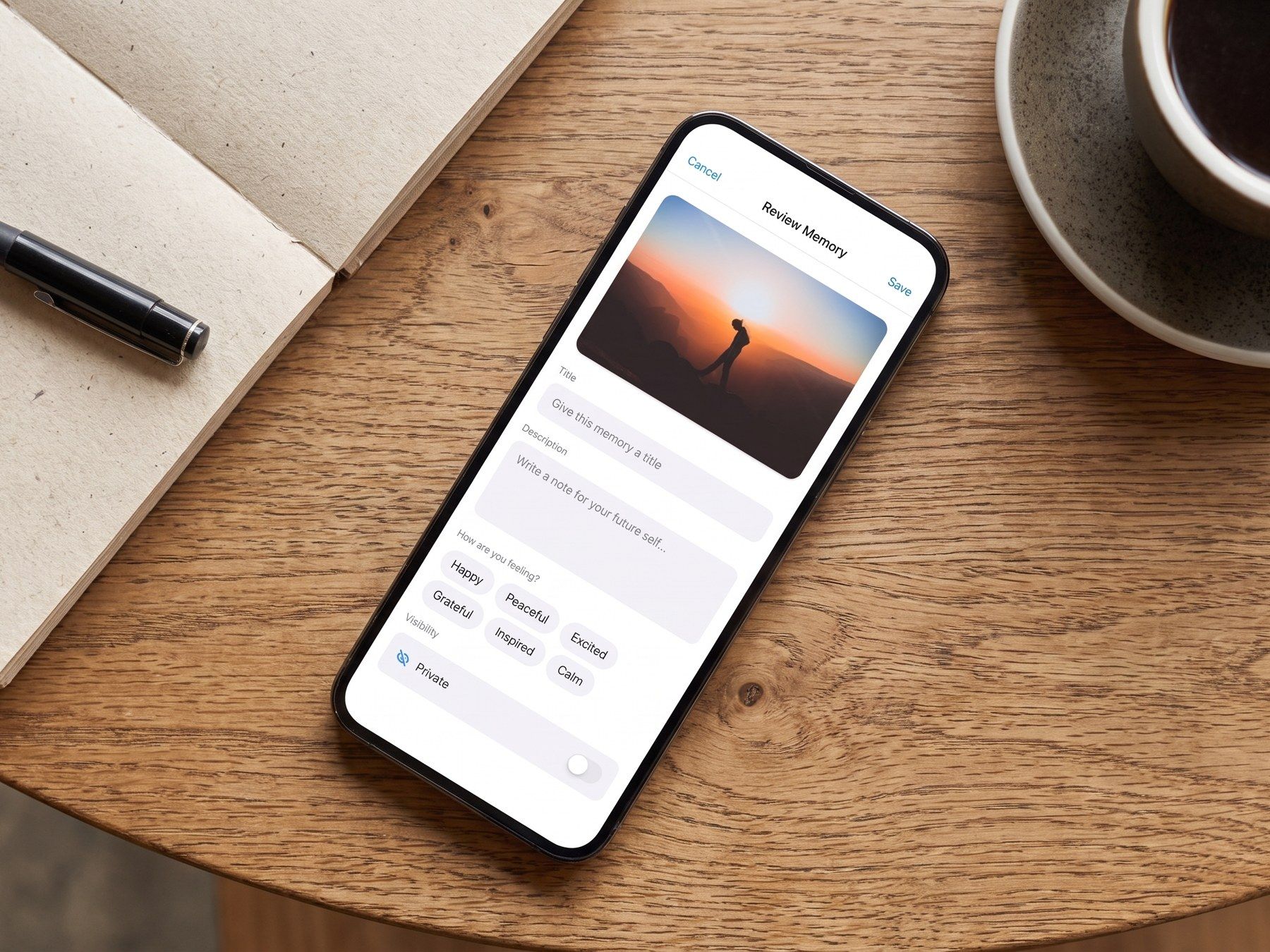
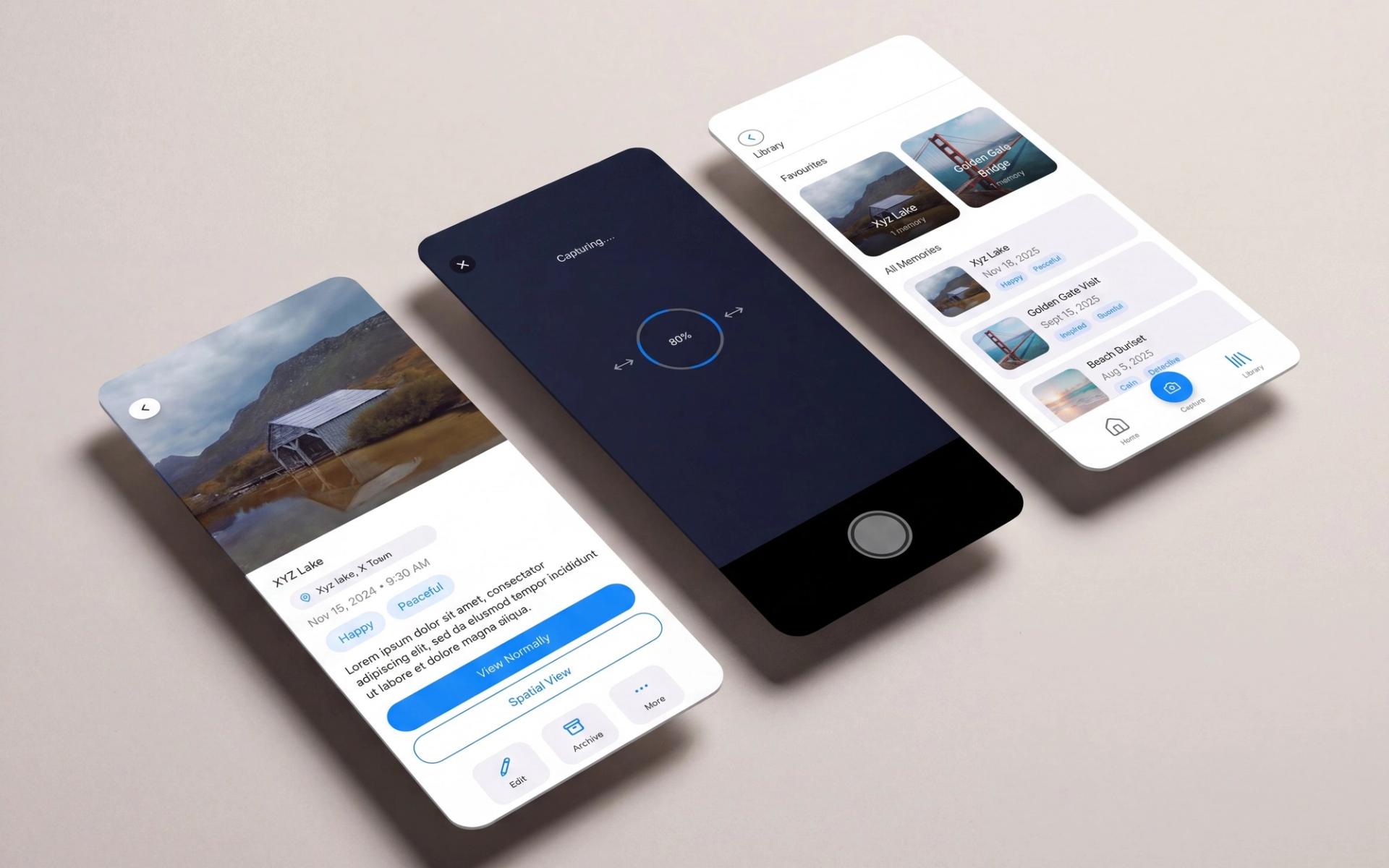
Editing and note-taking had been separate actions, and every participant paid for that split on every pass. Merging them took a whole node out of the information architecture and gave visibility a home where people were already looking for it.
The emotion chips each took their own colour after a user asked for it directly, so happy reads yellow and peaceful reads blue at a glance. A form field turned into something that looks like a feeling.
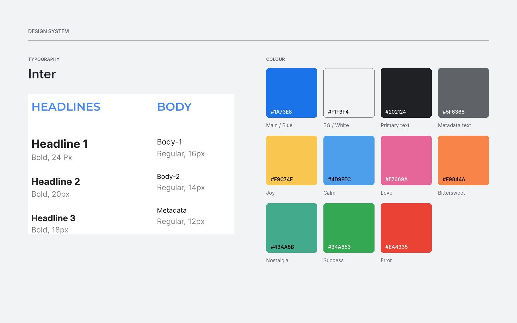
Inter throughout, a 14 to 16px floor for body text, and a spatial capture that works on a normal phone camera rather than demanding a depth sensor.
Results
Four minutes, or nine
The spread in the test told me more than the average did. Confident users finished the tasks in four to five minutes and only stumbled on the advanced features; the least confident took nine and struggled throughout.
Four of the five said they would use the app and the fifth said maybe, which is the honest result and the one that set the direction: the work left is not more features, it is fewer.
The strongest thing in the prototype was never the spatial capture. It was a text field and a coloured tag under a photo, at the place where the photo happened.
System
The palette is the feature
Most products pick accent colours and then invent reasons for them. Here the reasons came first.
Joy, Calm, Love, Bittersweet and Nostalgia are the emotion tags a person attaches to a saved memory, and each one is a token in the palette, so a library screen is legible as a mood before a single word is read. That put a constraint on everything else: if five colours already carry meaning, the interface itself gets one blue and three greys and nothing more. Green and red are held back for system feedback, never for sentiment.
Two swatches in the original guide are labelled with the wrong hex, Bittersweet and Success. The values here are sampled from the artwork rather than copied from the labels.
Next project