
Featured · 01
ORBIT
Year
2026
Role
Product & Interaction Design
Discipline
Product Design · Local-first AI
About
The file you know you have
A developer I interviewed searched for ChromaDB, then vector database, then architecture decision. The file was called ADR-004 and Spotlight cannot read inside a plain text file, so nothing came back.
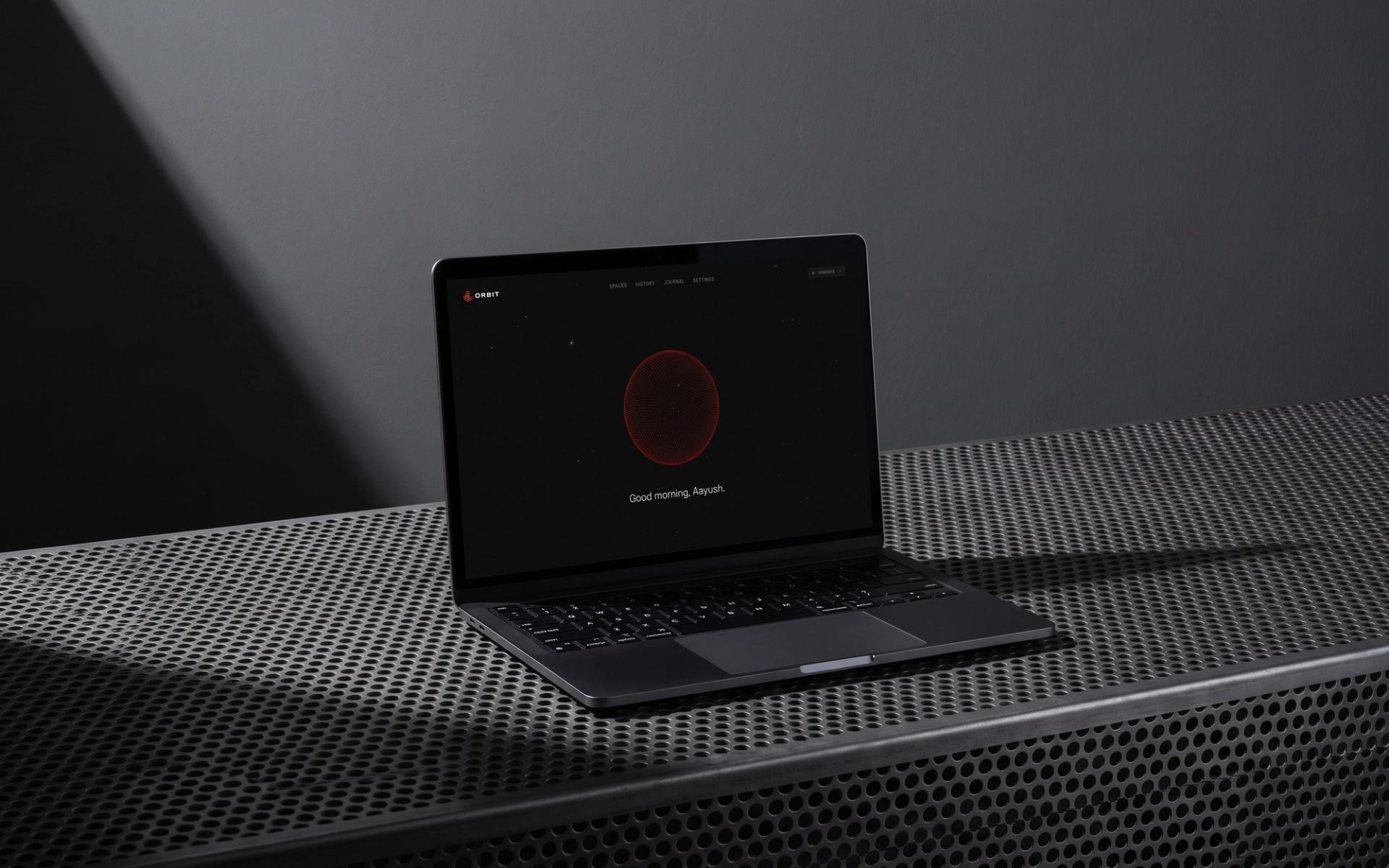
They had written it themselves, three weeks earlier. Orbit is the answer to that half hour: you describe what you are looking for, and it reads what is inside the file instead of matching the name. Nothing gets renamed, nothing gets moved, nothing leaves the machine.
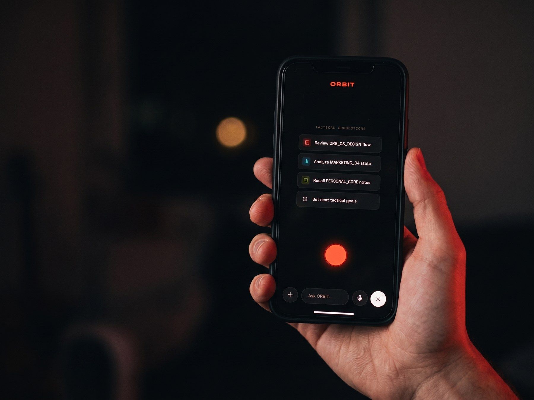
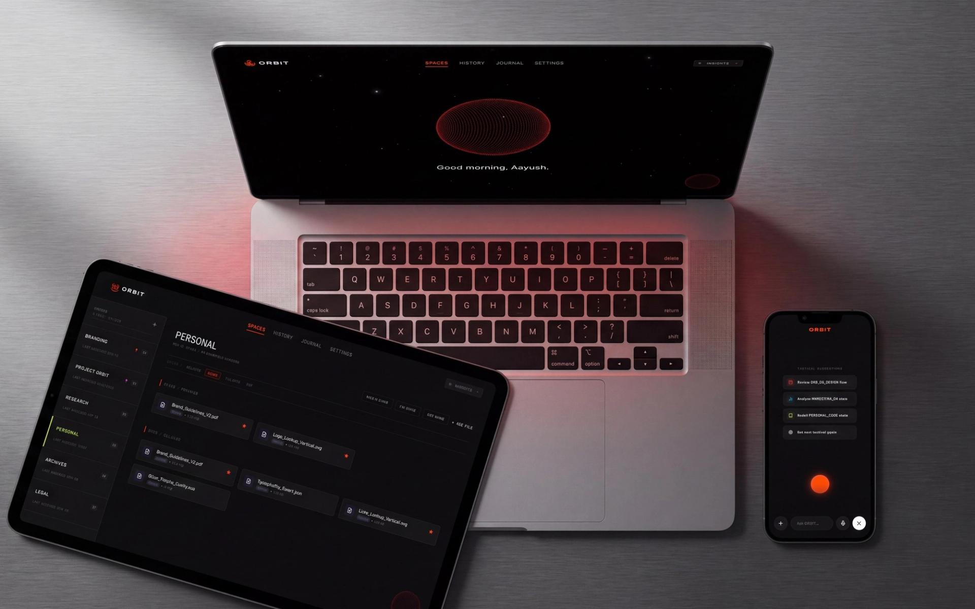
React and Three.js in front, FastAPI, ChromaDB and Ollama behind, plus a React Native companion that captures on the move and syncs when a connection returns.
Process
Ten laptops, opened on the table
A fourteen-question survey went out online and reached thirty working professionals across design, code, music, video and data. Ten talked to me afterwards, in person or over a call, with their real file systems open on screen, and I coded the transcripts thematically.
Everyone described a system, then described the week it collapsed. A filmmaker keeps folders per project and finds things by sorting on date modified and hoping. Six raised privacy before I asked, each naming something specific: NDA-bound code, unreleased music, footage of people who never consented.
87% regularly lose files they know they have; 80% have rebuilt one rather than keep hunting. The finding that redirected the project was the smallest one: nobody asked for better organising.
They asked to find the thing.
Challenges
The chat window had to go
I designed a conversational assistant first, because in 2026 that is the obvious shape. One participant dismantled it in a sentence: they did not want a conversation, they wanted to type something and see their file.
Retrieval is a utility, so the assistant became an overlay with one input. The first build then failed in ways that were entirely mine.
The shortcut collided with Spotlight. Indexing ran silently, so people assumed it had stalled. Clicking outside the overlay threw away the results.
One tester called that last behaviour the most frustrating interaction they had met in any app in recent memory. Retrieval completed at 80%, creating a Space at 70%, and every fix in v1.0 traces to a session rather than to my taste.
Craft
State you feel before you read it
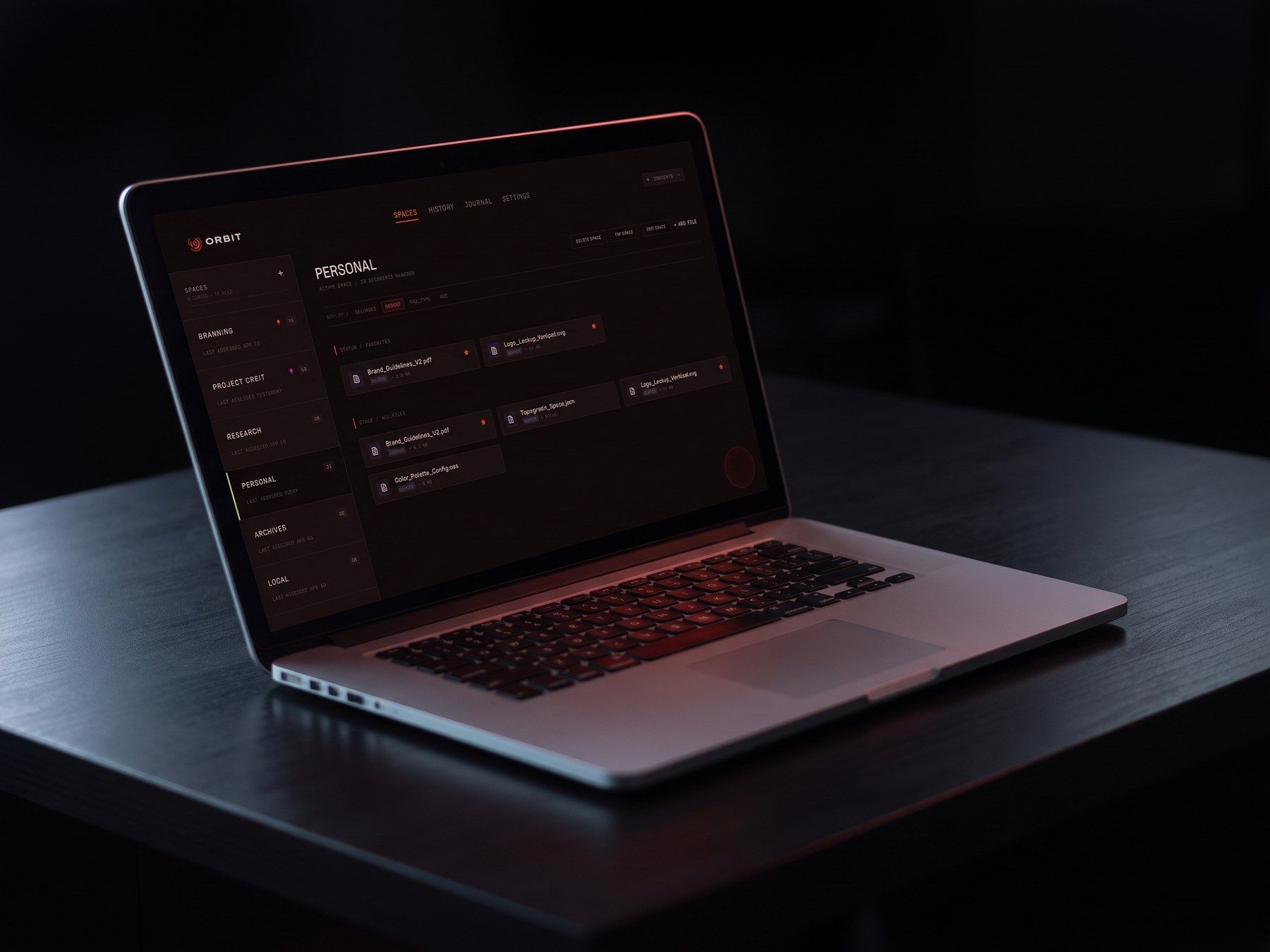
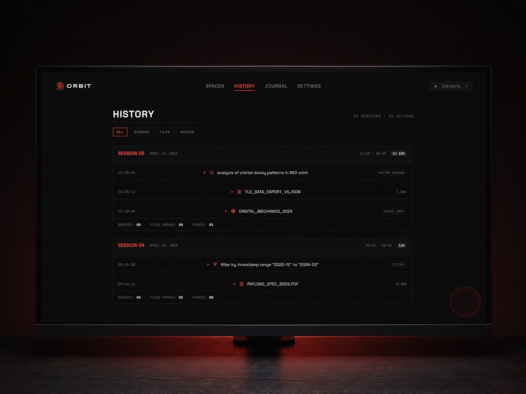
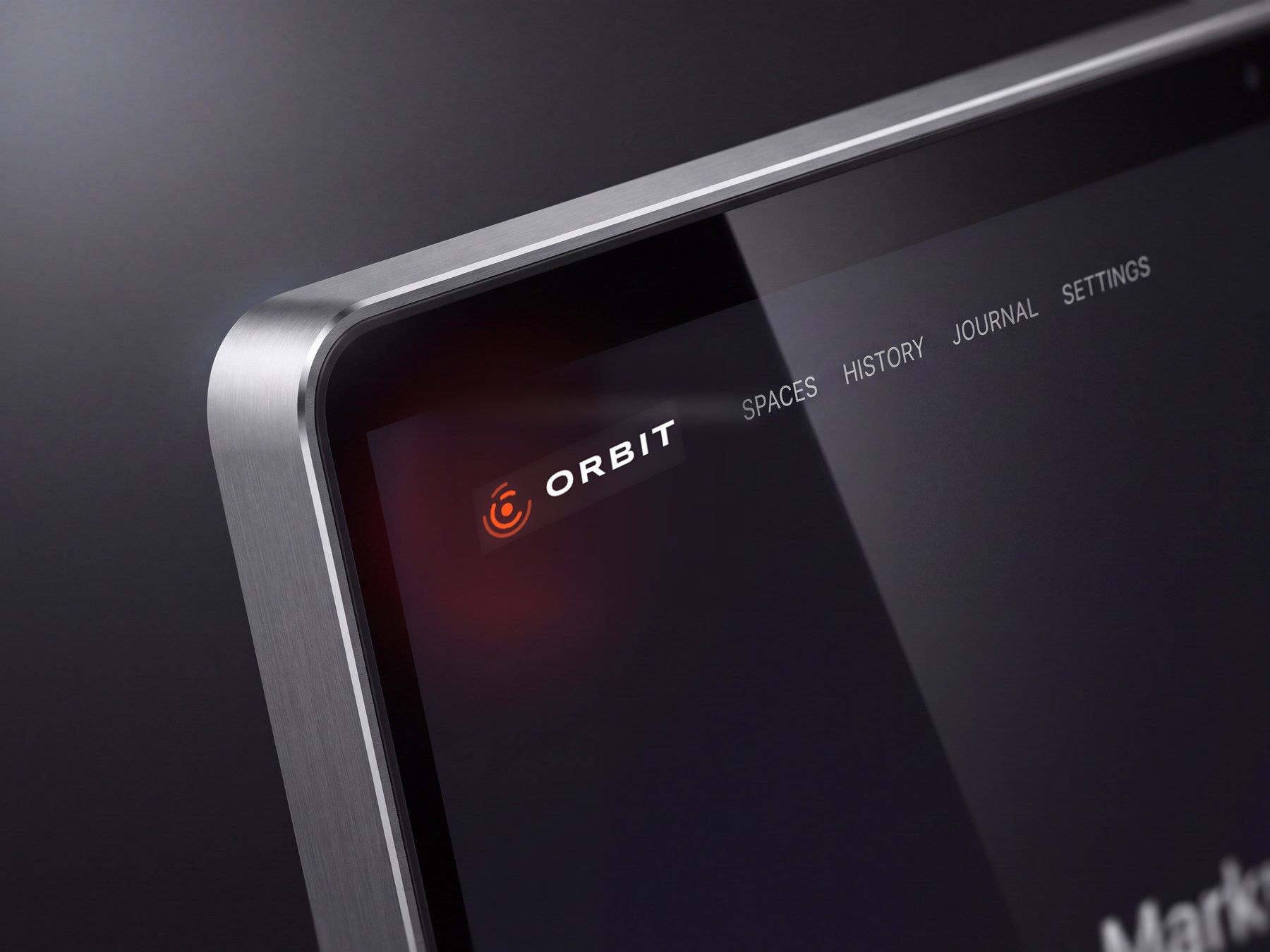
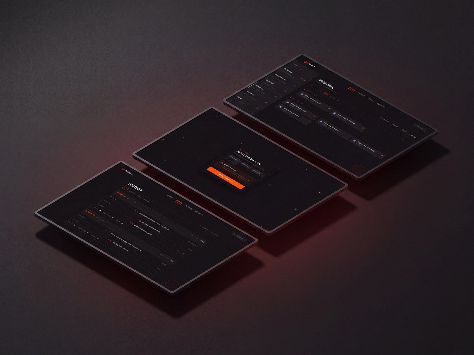
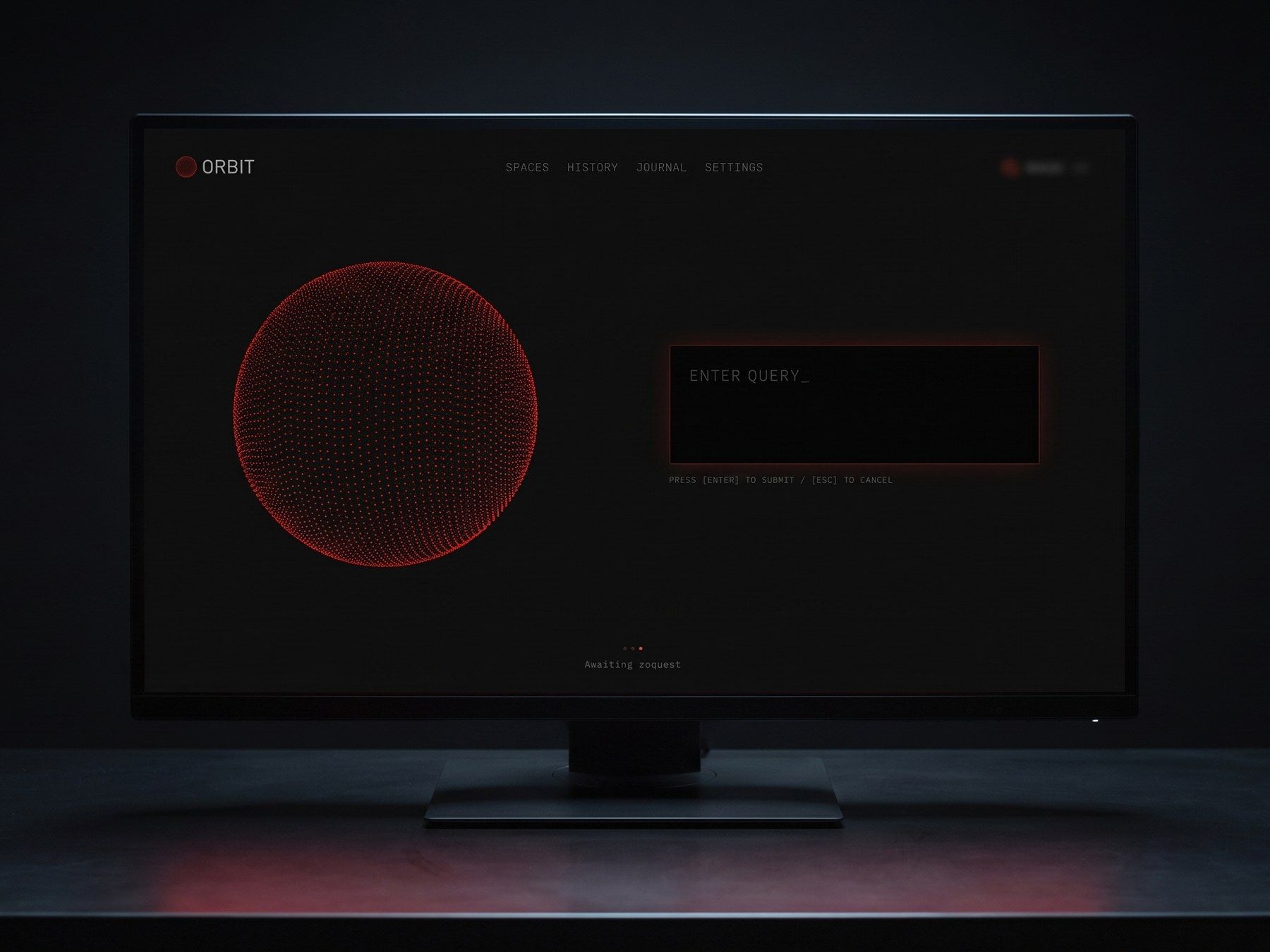
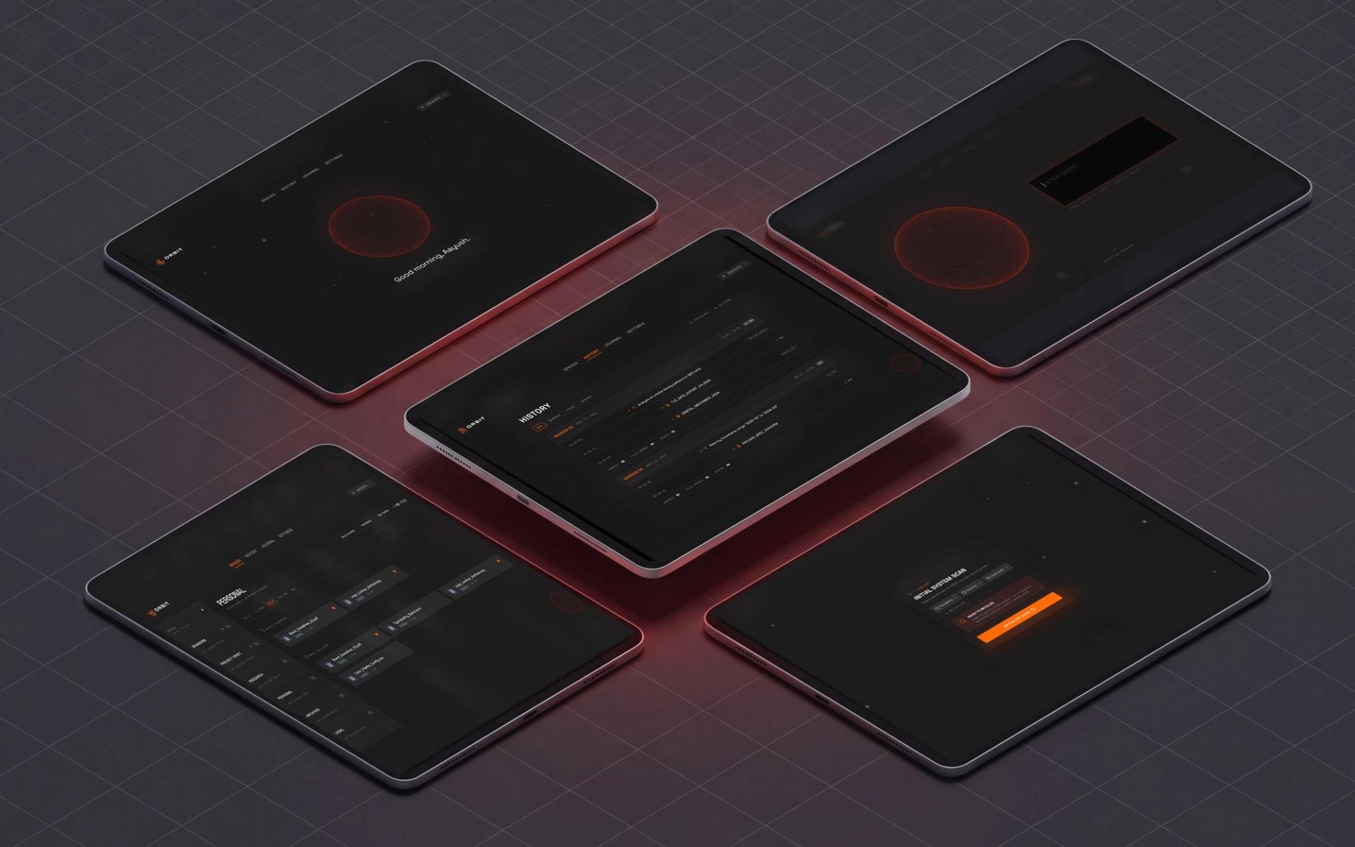
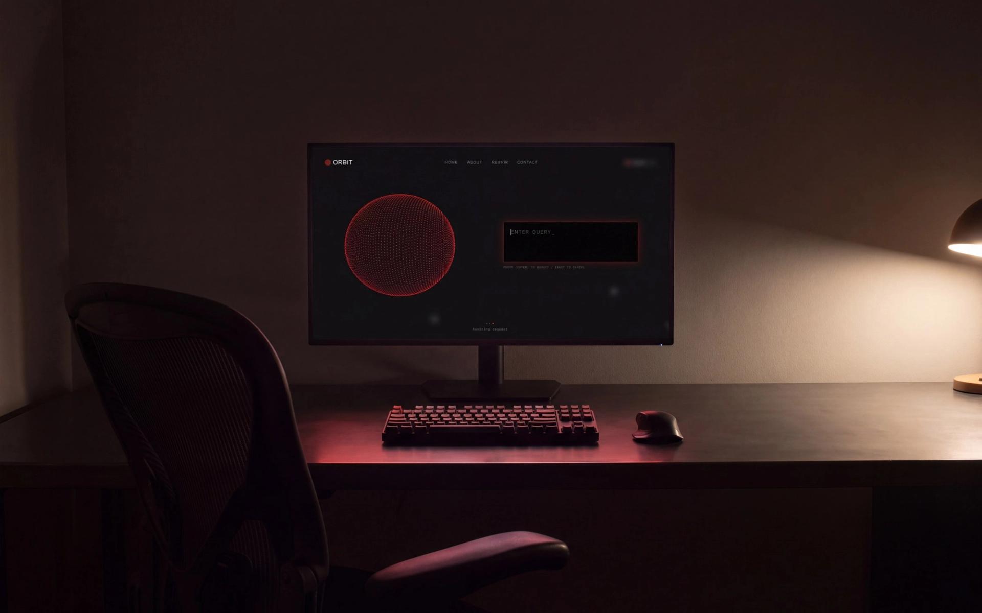
The interface is deliberately cold: black panels, one orange reserved for anything actionable, mono type for paths, timestamps and scores. Orbit does not greet you or perform enthusiasm, because it should read as a good tool rather than a friendly companion.
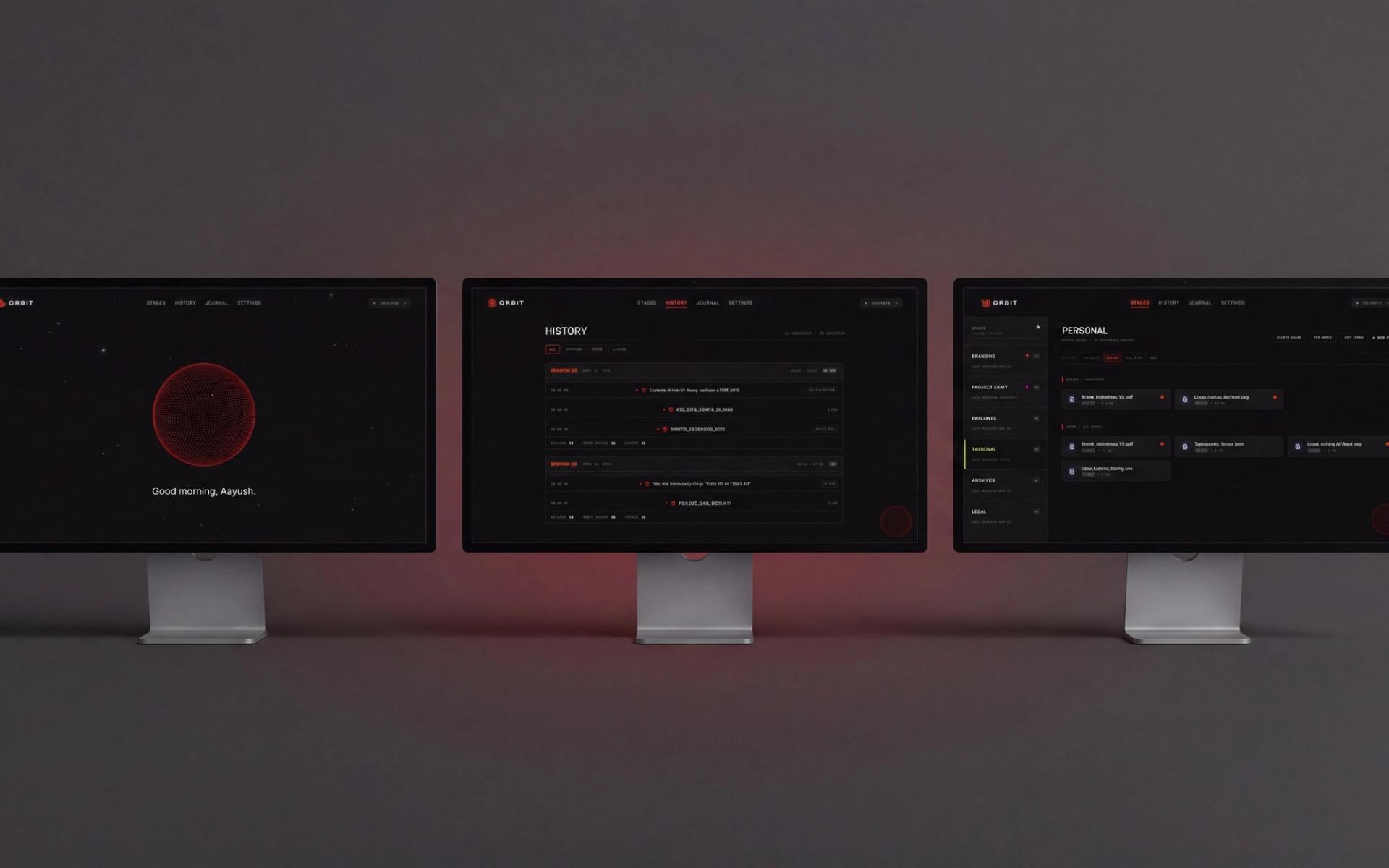
That left the problem of showing what the system was doing without a status bar. It ended up in one object. The orb breathes when idle, tightens as you type, pulses while it works, then slides left as results take the right of the screen.
Retrieval stays under 500ms on a consumer laptop with CPU-only inference, where embedding eats about 70% of the budget. A packet capture across a full session recorded zero outbound calls, which is the only privacy claim worth making.
Results
3.32 to 4.11 in ten days
The same ten people ran the same three tasks on v1.0. Retrieval went to 100%, Spaces to 90%, and mean satisfaction from 3.32 to 4.11 out of five.
Seven said they would put Orbit into their working week as it stood. The three who hesitated wanted the same missing thing: audio, video and image indexing, which the vector store already supports and the ingestion pipeline does not yet reach. That is the honest edge of the build.
One developer found four files in the first ten minutes that they had been chasing on and off for a week. I went in expecting people to want better organising tools, and spent four months building the opposite.
System
Colour reserved for machine state
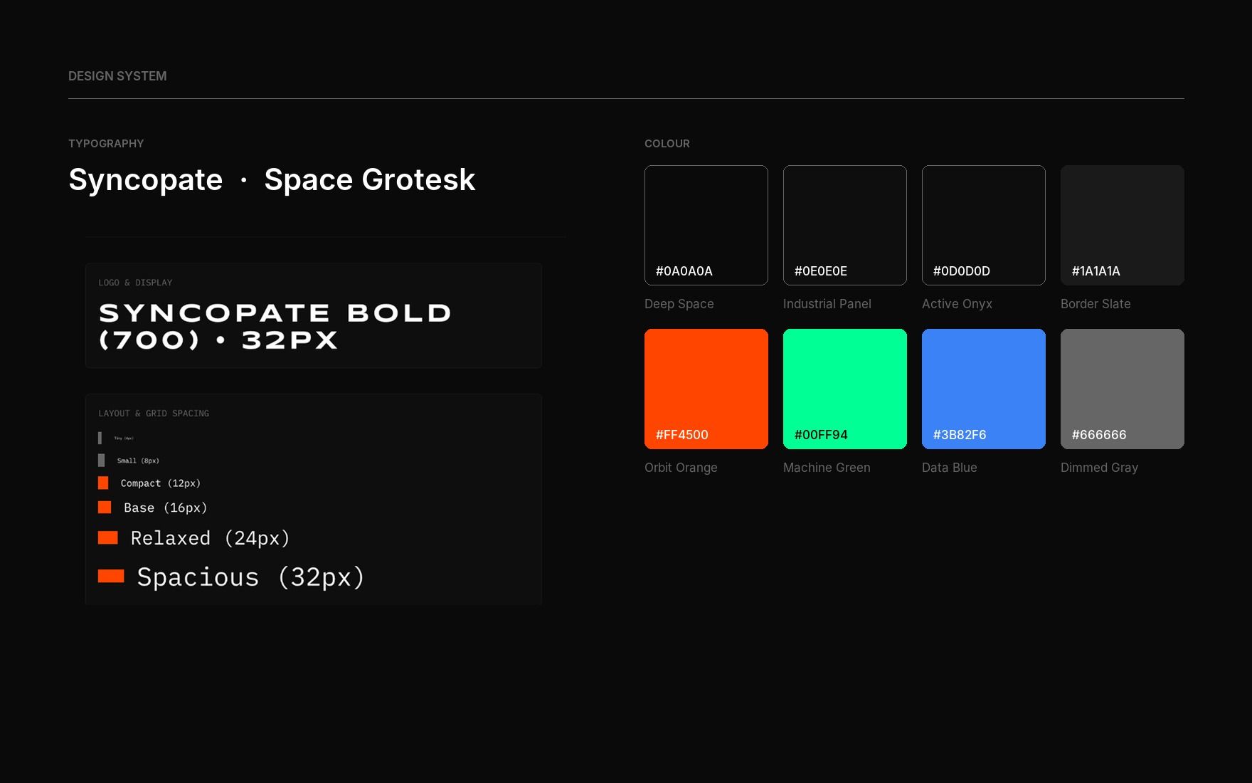
The interface is built almost entirely out of four near-blacks, separated by a few points of luminance rather than by hue. That sounds austere until you see what it buys: when the only saturated thing on screen is the retrieval itself, attention has nowhere else to go.
Orange marks what the machine is doing, green what it finished, blue what it found. Nothing decorative is allowed any of the three. Syncopate carries the wordmark and the display line because its wide letterforms read as instrument panel rather than app, and Space Grotesk does the reading work underneath it.
Spacing runs on a six step scale from 4px to 32px. Everything on screen sits on one of those six values, which is why a dense results table and an empty overlay still feel like the same product.
Next project