
Featured · 02
QUEUE
Year
2025
Role
UX Research & Multimodal Design
Discipline
Multimodal · AI & AR
About
The decision happens in the wait
Two things go wrong in a salon and they are the same thing. Clients decide on a haircut from a photograph of somebody else's head, and they do it in the chair while the shop backs up behind them.
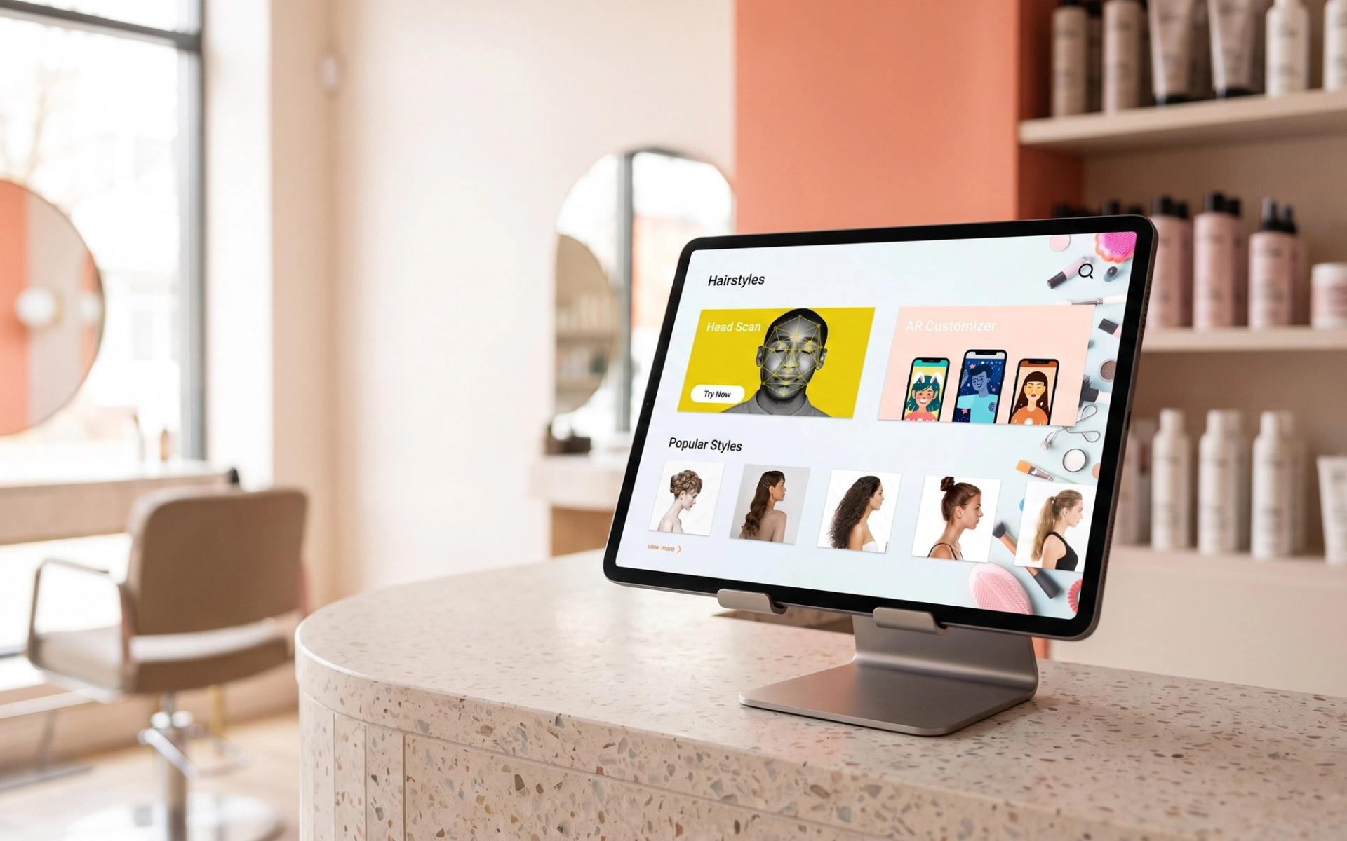
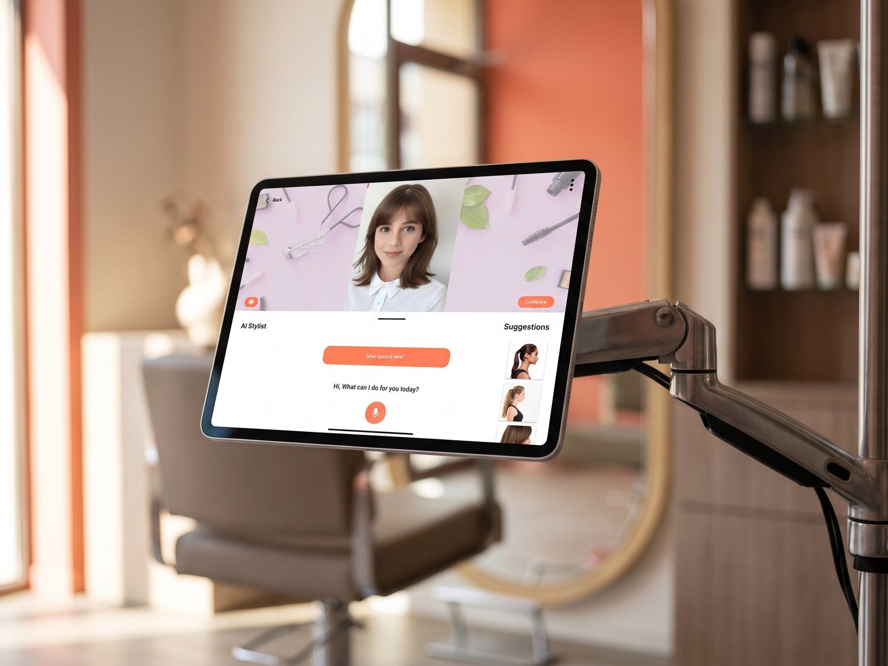
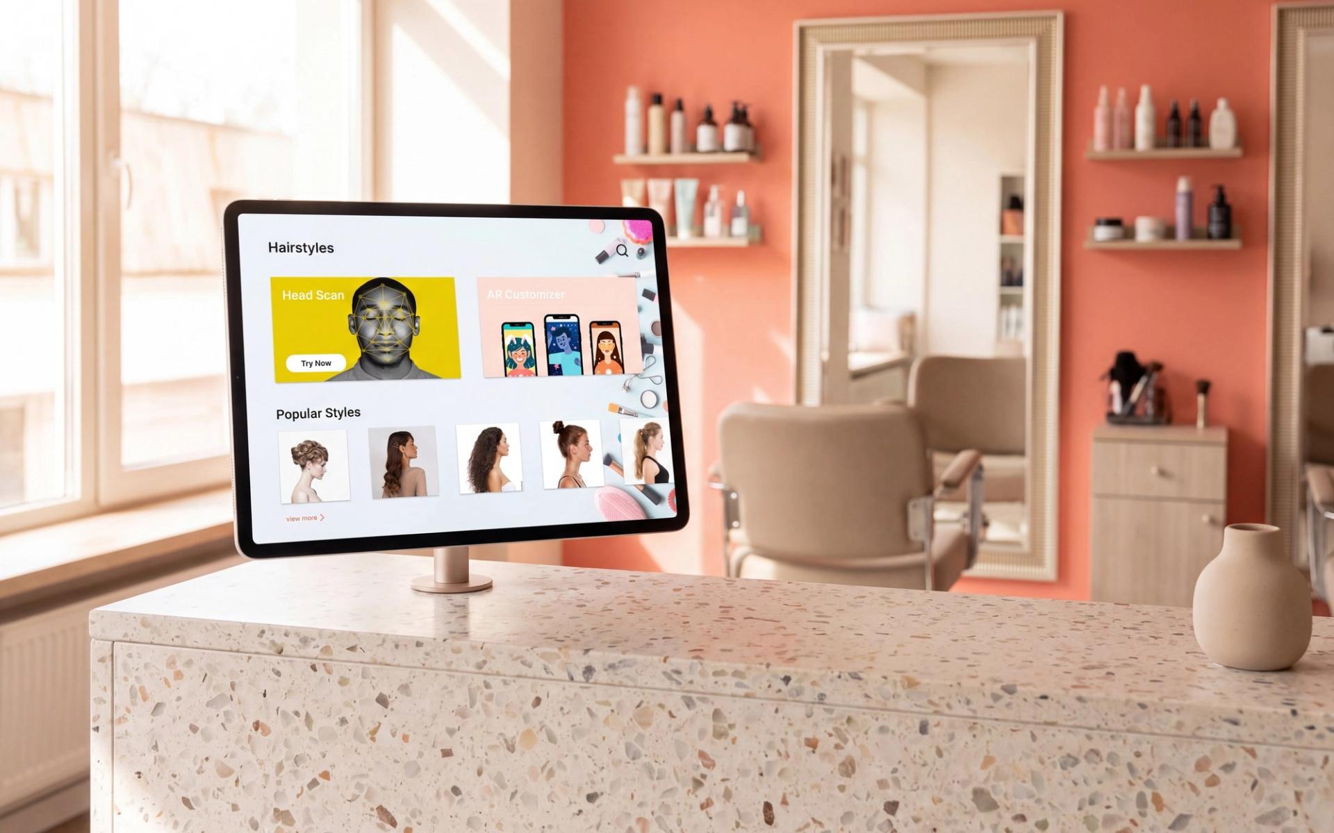
Queue is a kiosk that moves the decision into the waiting time: it maps your face, renders styles onto you live, answers questions out loud, and hands a chosen look to your stylist before you sit down.
Built with Armaan Hawes. Camera, touch and voice, each carrying the part of the job it is actually good at.
Process
Five interviews, one honest survey
Five conversations gave us the failure in people's own words. A software engineer described leaving with blunt bangs that clashed with their face shape and called it a disaster.
A stylist described the same gap from the other side of the chair: clients arrive with expectations built from pictures, and somebody has to bridge fantasy and reality before any cutting starts. A short survey shared online put numbers behind them. Seventy-eight percent could not judge what suited their face shape; sixty percent could not picture the outcome at all.
Two-thirds called themselves only somewhat comfortable with AR, which we read as a warning rather than an endorsement. The interest was in seeing themselves, not in operating something novel.
Challenges
Throwing away the app
We designed this for a phone first, and user and faculty feedback took it apart. A phone screen is the wrong size for judging a haircut, and an app asks for a download at the exact moment someone is walking through a door.
One interviewee had already told us they did not trust technology much and asked whether an app would be usable by someone who is not tech-savvy. We were quietly excluding the person who needed the visualisation most. The deeper problem was timing: an app used at home does nothing for the queue.
Moving to a kiosk answered the business objection too. Shorter consultations, more appointments in a day, and a natural place to recommend the products that go with the look.
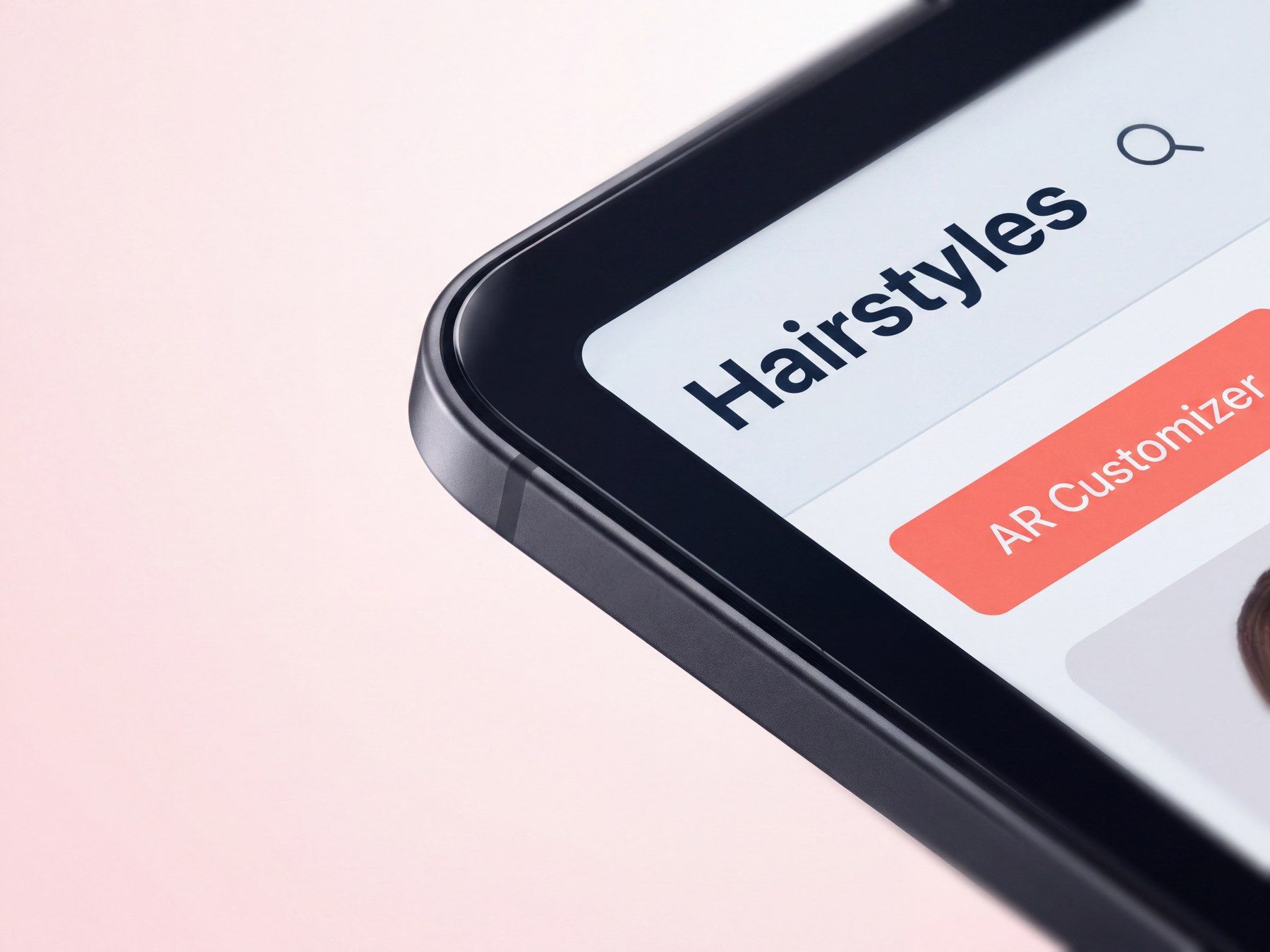
Craft
Three inputs, three jobs
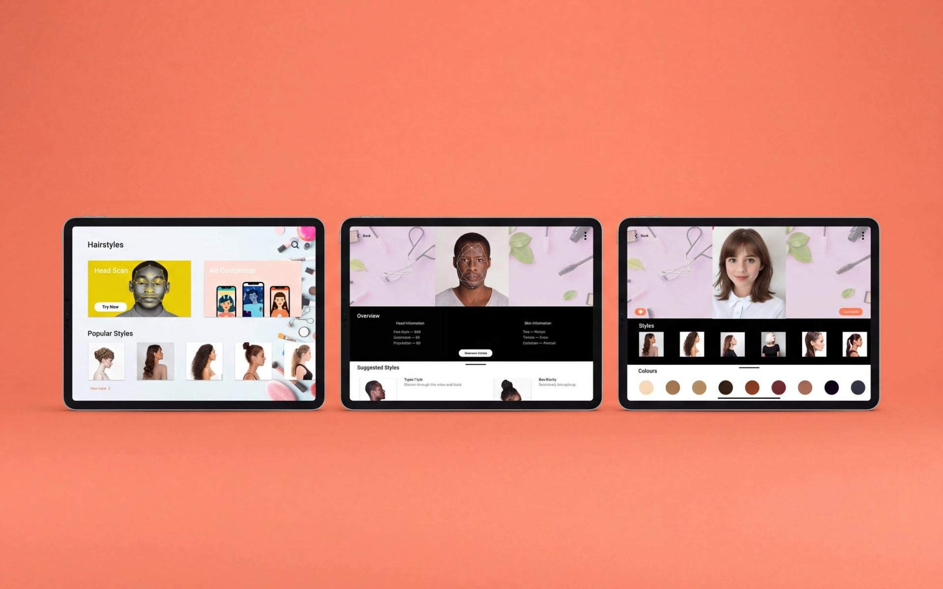
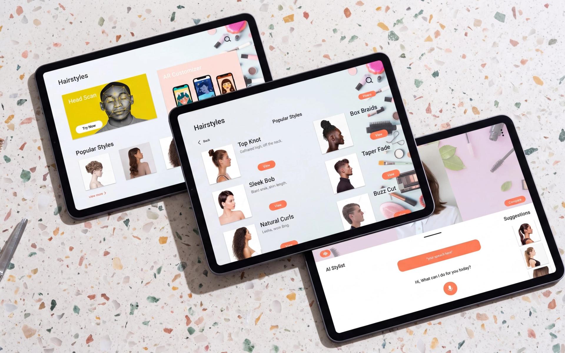
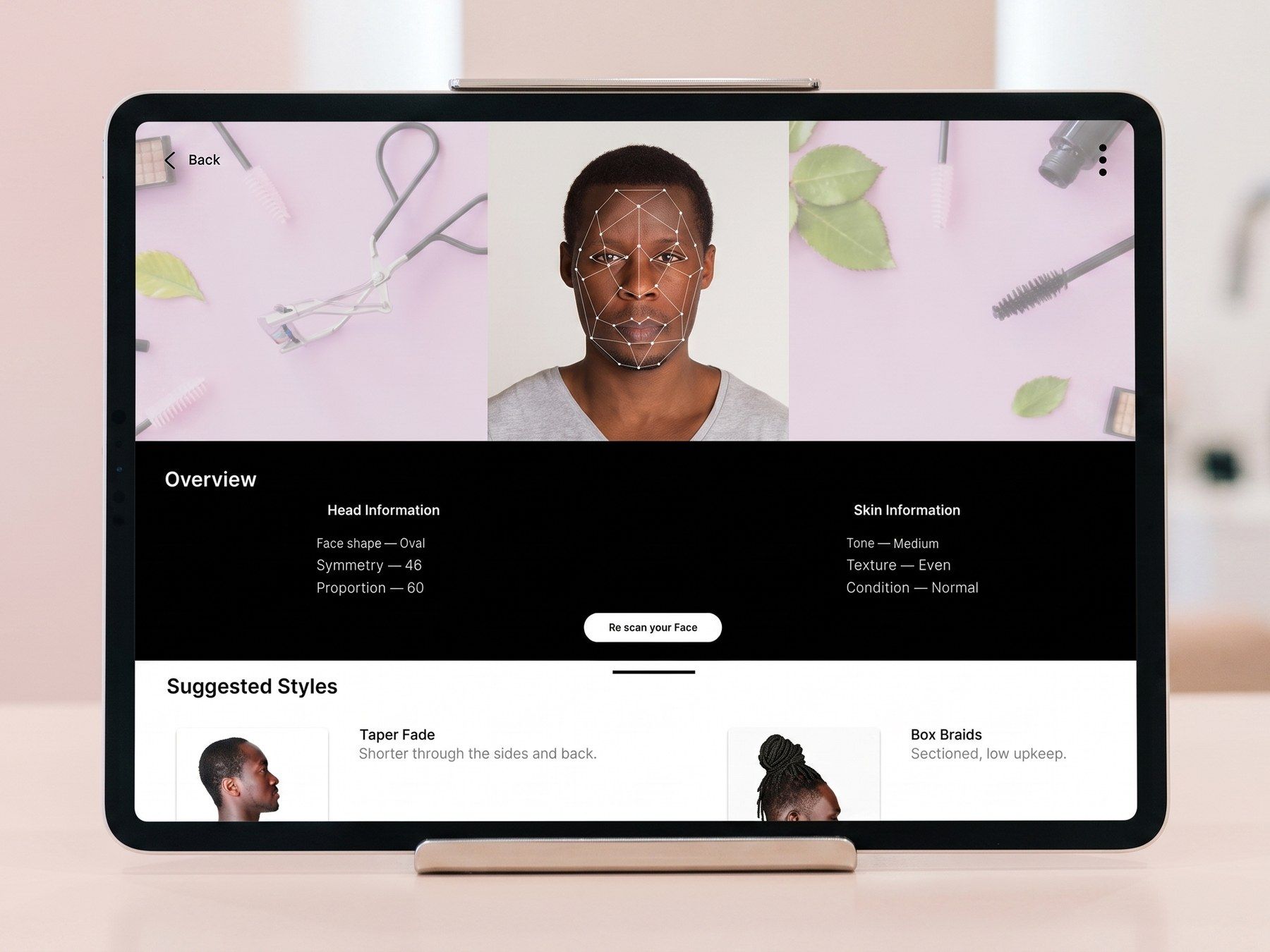
The camera measures. A head scan returns structure, proportion, texture and skin condition as an overview rather than a verdict, because a system that tells someone their face is the wrong shape has failed at its only real task.
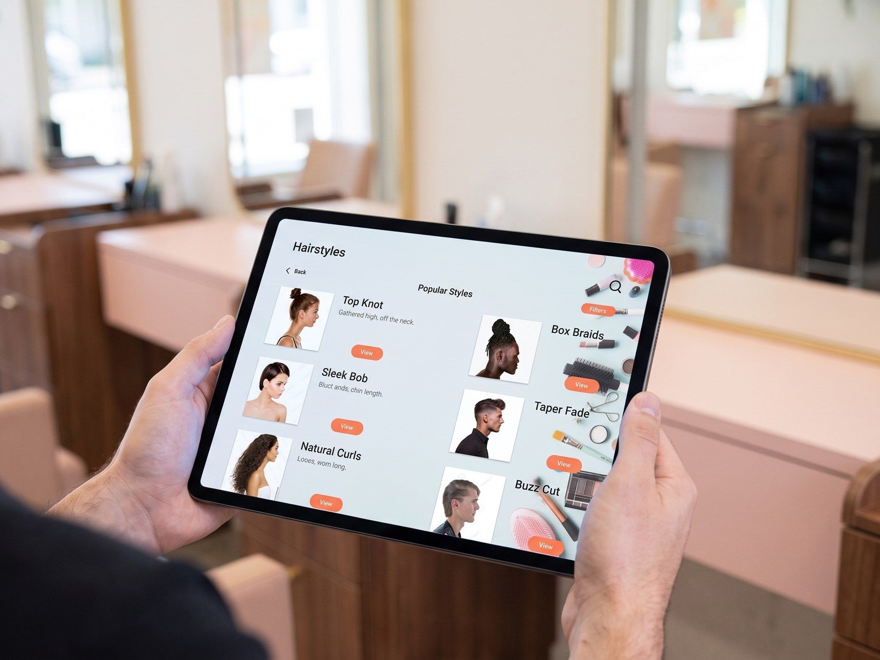
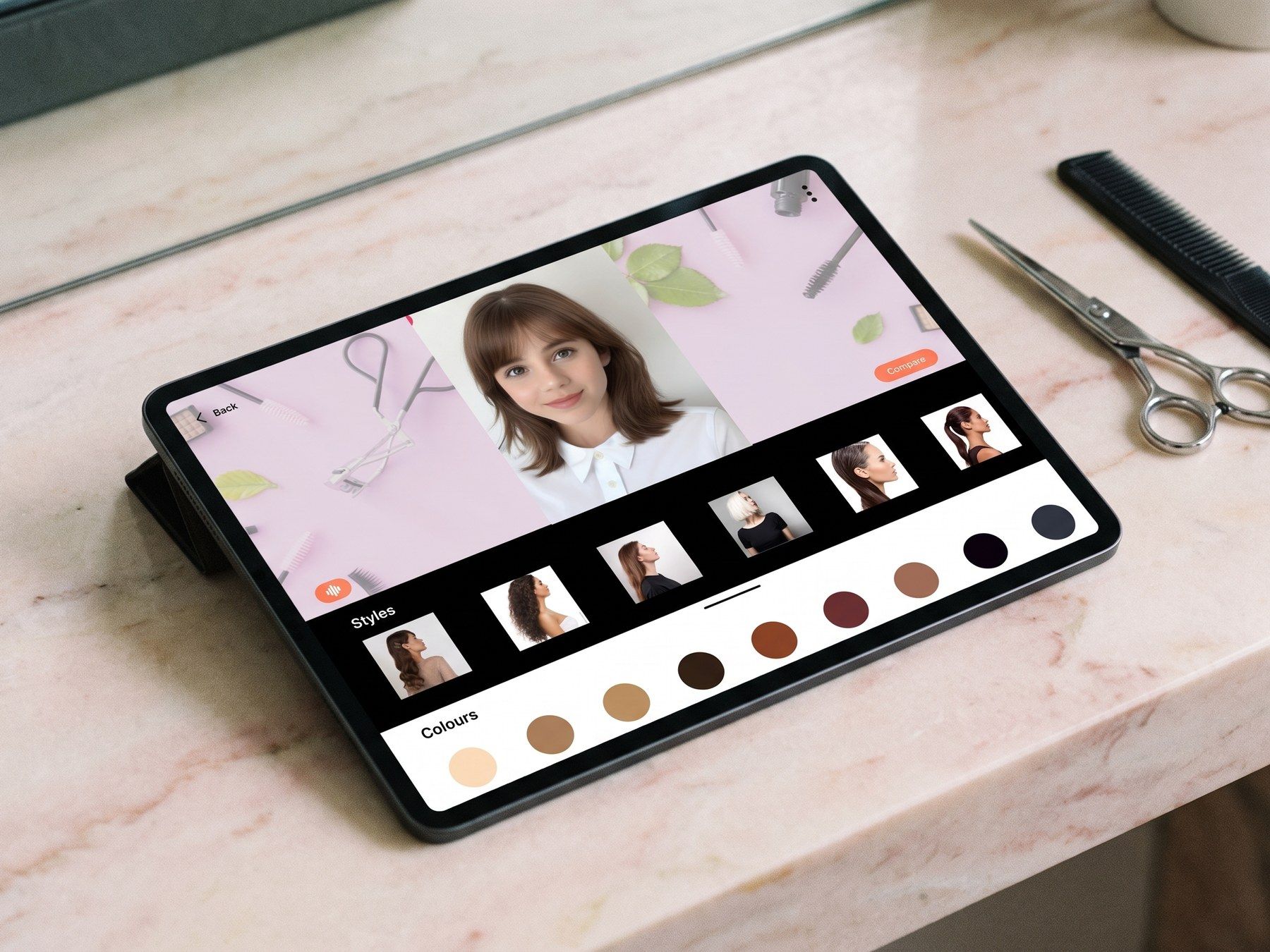
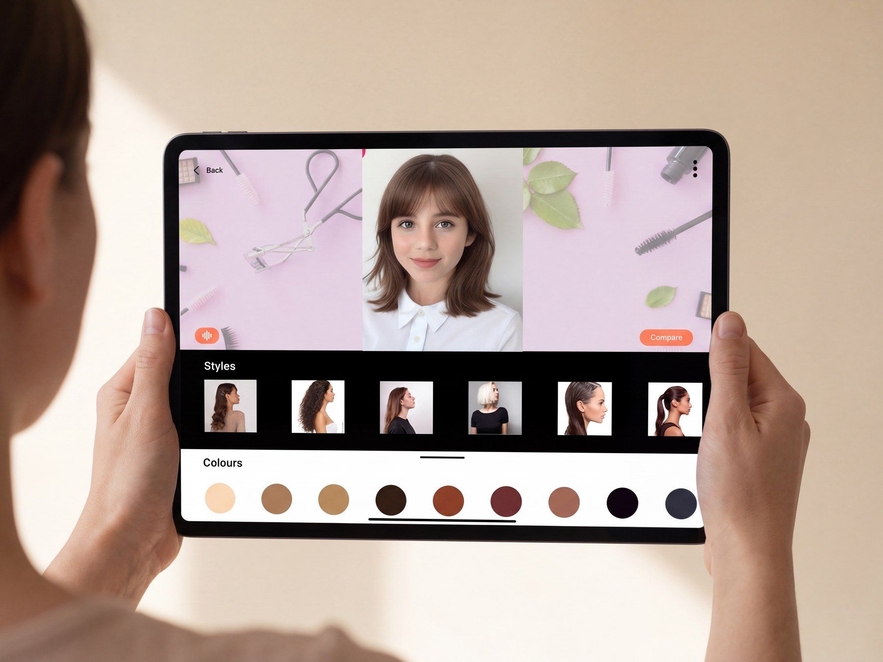
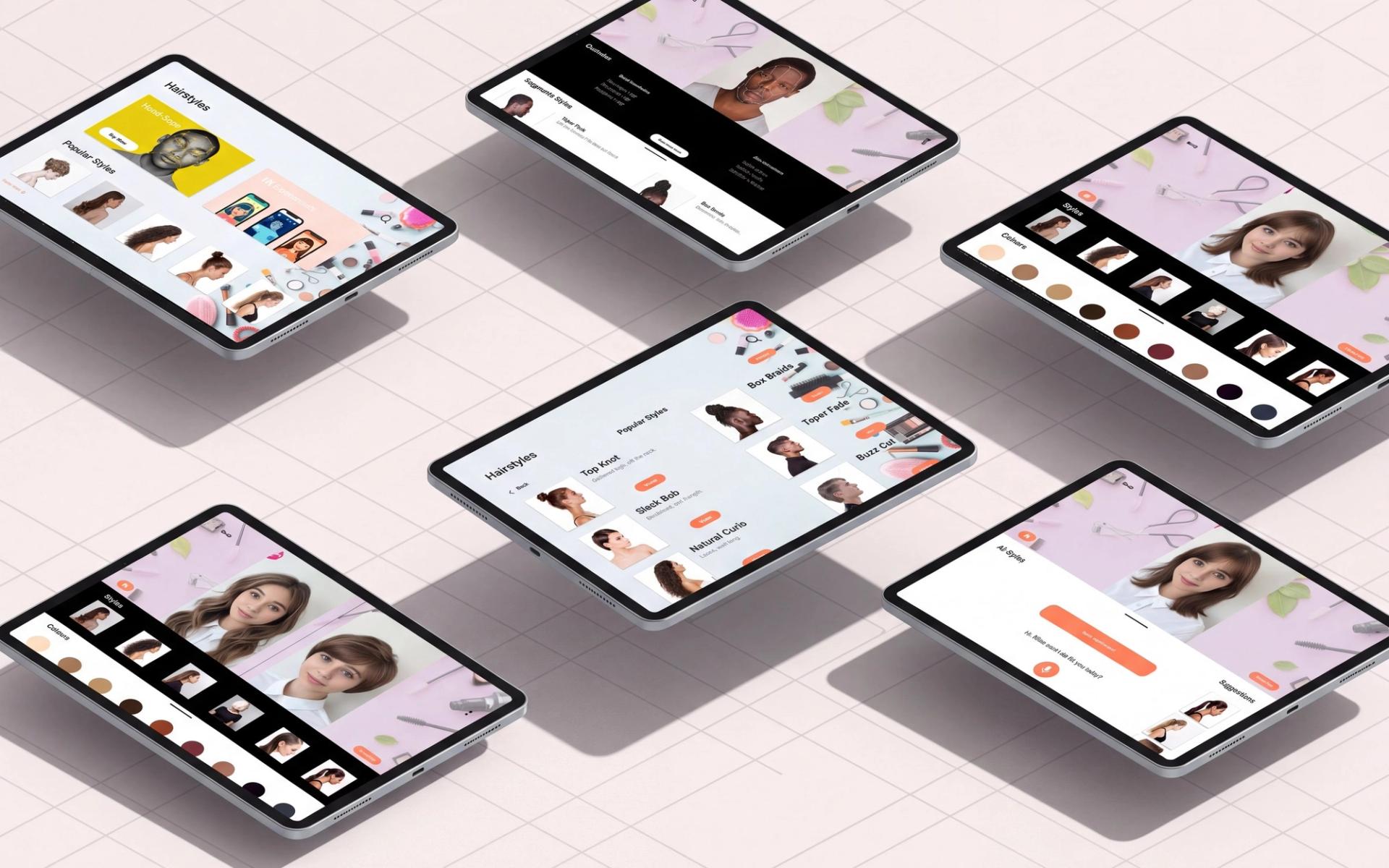
Touch browses: style filmstrips, a colour row from blonde to blue-black, and a compare view holding two options side by side. Voice asks, and it is the entry point for anyone who would never have found a filter menu.
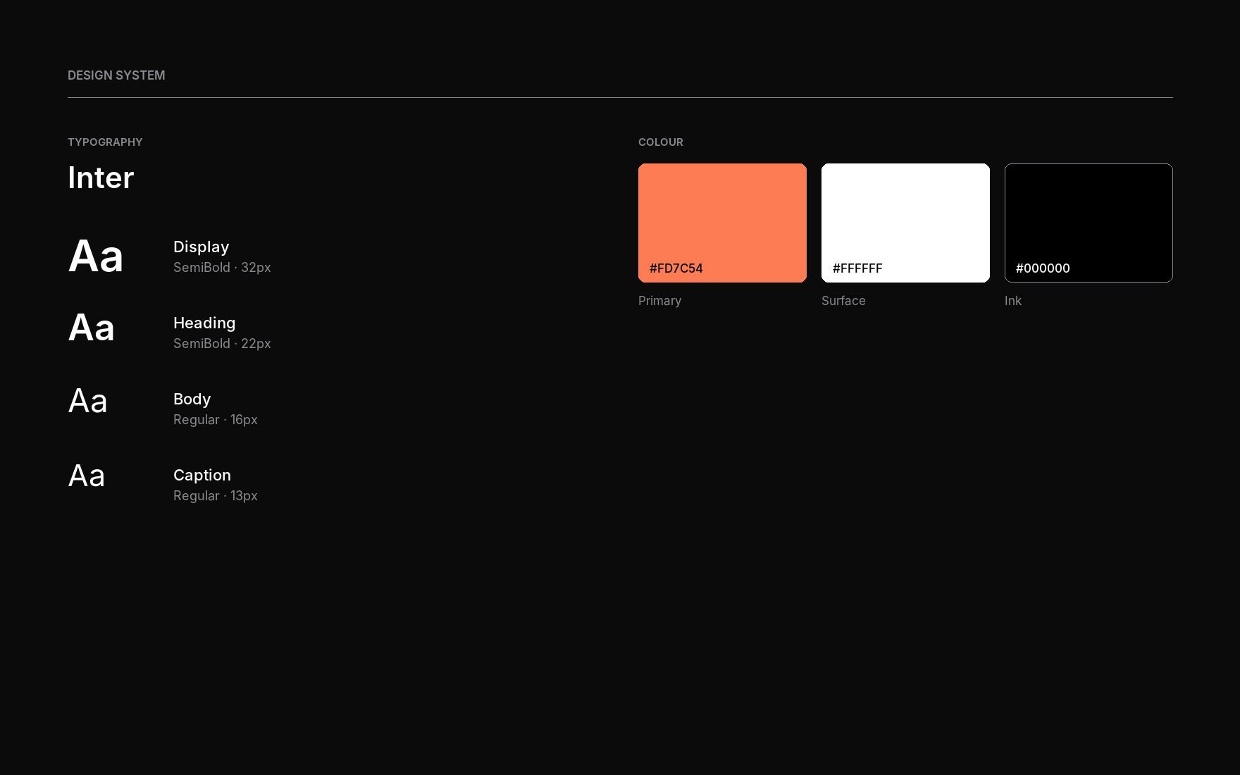
Coral against white and black, Inter and Poppins, and screens sized for reading texture and length at arm's length rather than thumb distance.
Results
What the waiting area is for
The kiosk changes the shape of the visit. Time that produced nothing now produces a decision, and the stylist meets a client who has already narrowed the field instead of one holding a photograph and a hope.
Both people end up looking at the same image, which is where real expertise finally has room to work rather than being spent on translation.
What it never got was a usability round, and I would rather say that than dress the pivot up as validation. Three things were still open: makeup, nails and skin sitting at the level hair reached, real testing on the compare and voice flows, and the privacy handling that face scanning in a commercial space owes its users.
System
Built to be read by two people at once
A kiosk is not a phone. The client is looking at it from a seat and the stylist is looking at it over their shoulder, so every size decision was made at arm's length rather than at reading distance.
The palette is deliberately three values: coral for anything you can act on, white for the surface, black for the type. Nothing else earns a colour, which means the one coral element on a screen is always the thing to touch. It also survives the room, since salon lighting is warm and bright and washes out anything subtler.
The photographs do the heavy lifting, so the interface around them stays almost colourless on purpose. A style card is mostly hair.
Next project